Page 2 of 4
Re: Very Short Octave Sign Rant
Posted: 28 Sep 2019, 16:55
by MalteM
MalteM wrote: ↑27 Sep 2019, 06:02
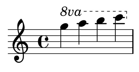
LilyPond 2.19.83 default:
lilypond.png
IMO the full-size “va” looks very bad but the right edge looks cleaner than the dashed ones (especially Durand).
By the way, LilyPond had a dashed vertical right edge until version 2.19.13:
- lilypond2.19.13.png (14.74 KiB) Viewed 6533 times
This was changed on purpose following Gould’s recommendation, see
issue tracker and
git commit.
I’ll take this thread as an occasion to improve LilyPond’s possibilities (give the user the possibility to 1. change the “8va” default texts, 2. dash the right edge 3. change the vertical alignment of “8va” text and the line).
Re: Very Short Octave Sign Rant
Posted: 28 Sep 2019, 17:43
by John Ruggero
Wow, am I impressed (as I so often am) with LilyPond and the LilyPond community. By all means, give the users all the possibilities. I have never seen such a large va in an octave sign, and I am pretty sure it is non-standard, so you might want to change the default on that for sure. Also the size and boldness of the 8. The dashed line is in the ballpark but come to think of, maybe another reason for the very small, close together dashes has to do with the ending vertical: it can have more of them.
For some reason, I hadn't consulted Gould on this one. She seems to have everything right regarding the design (although I prefer a slightly lower join of the 8 and line, and a little larger 8) and her reasoning about the visibility of a solid ending line is certainly true if one uses a short hook rather than the highly visible and eye-directing variable length hook I see in much engraved music.
Re: Very Short Octave Sign Rant
Posted: 28 Sep 2019, 18:11
by Schonbergian
The 8va text looks to just be boilerplate italic New Century Schoolbook.
Re: Very Short Octave Sign Rant
Posted: 28 Sep 2019, 19:51
by teacue
I find it always very interesting and instructive to read opinions on the appearance of such things.
Alone I would not be able to "see" how important it can be.
Thanks for this.
I quickly tried to mimic the last example of John Ruggero in Dorico
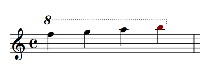
- dorico octave line.jpg (46.12 KiB) Viewed 6520 times
BTW Dorico can quite very precisely determine how the dots look like (see Advanced options )
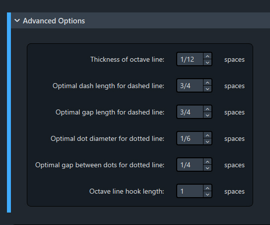
- dorico octave line some options.jpg (110.66 KiB) Viewed 6520 times
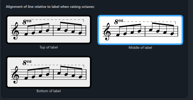
Dorico offers 3 vertical positions (see Alignment of line ...)
- dorico octave line alignment.jpg (107.97 KiB) Viewed 6520 times
Re: Very Short Octave Sign Rant
Posted: 28 Sep 2019, 20:57
by John Ruggero
I like your Dorico version a lot, teacue, and I am very glad that you found this thread informative. Of course, the attachment point is unavoidably low for my taste but this has been discussed already.
It does puzzle me that Dorico offers so much control over the line but only three possible alignments, as if implying that only these are acceptable; whereas, to me, none of them are. And the hook length needs to be adjustable as needed. I hope (if only for my own sake) that as the product matures it will aim more at engravers who need control over every aspect on the page. If they did that, there would be a stampede to Dorico from all the major publishers.
Re: Very Short Octave Sign Rant
Posted: 30 Sep 2019, 06:13
by OCTO
Can't agree more with John.
And these parameters should be controllable not only as per-document, but also per-item. Even the hook has to be additionally edited in a certain cases.
That is why I always use a desktop publishing software and a vector editor. To achieve "manual editing" one indeed needs at least 3 different type of software.
Re: Very Short Octave Sign Rant
Posted: 30 Sep 2019, 16:33
by John Ruggero
OCTO wrote: ↑30 Sep 2019, 06:13
And these parameters should be controllable not only as per-document, but also per-item
OCTO wrote: ↑30 Sep 2019, 06:13
To achieve "manual editing" one indeed needs at least 3 different type of software.
These two statements summarize the present state of music notation software perfectly. It needs a lot of outside help to get to a professional level.
And unfortunately, as we have seen in recent engraving by previously excellent publishers, it has started to drag down the professional level.
Re: Very Short Octave Sign Rant
Posted: 30 Sep 2019, 17:29
by tisimst
Schonbergian wrote: ↑28 Sep 2019, 18:11
The 8va text looks to just be boilerplate italic New Century Schoolbook.
That's because it is. LilyPond's music font doesn't have dedicated ottavation symbols and so it utilizes the default serif font, which is Century Schoolbook L, a fine choice if you ask me, though maybe bold italic could do better. For text-like symbols, the only exception are the dynamic letters f, m, p, r, s, and z.
Re: Very Short Octave Sign Rant
Posted: 30 Sep 2019, 17:52
by MalteM
tisimst wrote: ↑30 Sep 2019, 17:29
Schonbergian wrote: ↑28 Sep 2019, 18:11
The 8va text looks to just be boilerplate italic New Century Schoolbook.
That's because it is. LilyPond's music font doesn't have dedicated ottavation symbols and so it utilizes the default serif font, which is Century Schoolbook L, a fine choice if you ask me, though maybe bold italic could do better. For text-like symbols, the only exception are the dynamic letters f, m, p, r, s, and z.
In newer versions, the default serif font is TeX Gyre Schola (which looks the same) and in not yet released versions the dynamic letter n for niente is added.
But that reminds me of something that LilyPond is definitely missing. For time signatures there are digits from

to

which are used in smaller sizes f. e. also for fingerings but there are no corresponding italic digits (which could be used for original or alternative fingerings and ottava marks). Until such numbers are added one probably should bold italic numbers from the serif font …
Re: Very Short Octave Sign Rant
Posted: 30 Sep 2019, 17:59
by tisimst
MalteM wrote: ↑30 Sep 2019, 17:52
tisimst wrote: ↑30 Sep 2019, 17:29
Schonbergian wrote: ↑28 Sep 2019, 18:11
The 8va text looks to just be boilerplate italic New Century Schoolbook.
That's because it is. LilyPond's music font doesn't have dedicated ottavation symbols and so it utilizes the default serif font, which is Century Schoolbook L, a fine choice if you ask me, though maybe bold italic could do better. For text-like symbols, the only exception are the dynamic letters f, m, p, r, s, and z.
In newer versions, the default serif font is TeX Gyre Schola (which looks the same) and in not yet released versions the dynamic letter n for niente is added.
But that reminds me of something that LilyPond is definitely missing. For time signatures there are digits from
to
which are used in smaller sizes f. e. also for fingerings but there are no corresponding italic digits (which could be used for original or alternative fingerings and ottava marks). Until such numbers are added one probably should bold italic numbers from the serif font …
You are, of course, correct. Tex Gyre Schola is very VERY closely modeled after the original Century Schoolbook face and since has a much greater language coverage, so it's no surprise that Tex Gyre Schola is the primary serif font now.