Page 1 of 3
Accidentals alignment
Posted: 04 Oct 2019, 09:45
by Schneider
Hi,
Please consider the following LilyPond default outputs:
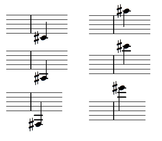
- accidentals-ledger-lines-default.jpg (45.23 KiB) Viewed 7972 times
So it looks like LP changes the accidental sign alignment after more than 2 ledger lines.
What do you think about this output?
Cheers,
Pierre
Re: Accidentals alignment
Posted: 04 Oct 2019, 10:41
by OCTO
Personally, I don't like it.
And also I don't think there should be accidental/line kerning except crowded situations. Dorico does it by default (I think), and in my opinion it looks a bit "silly". That is presumably a good feature, but as with medicine -- you take it only when needed.
Re: Accidentals alignment
Posted: 04 Oct 2019, 14:14
by John Ruggero
I agree with OCTO. Only in crowded situations, and in crowded conditions one might shorten all the ledger lines with and without accidentals. What bothers me about your examples is the drastic difference in length between the shortened and the remaining ledger line(s), some of which practically touch the sharps. From what I see in several randomly-selected editions by different publishers, if there is a difference in length, it should be slight.
But at least you can control the length of ledger lines in LilyPond. I have major problems with this in Finale.
Re: Accidentals alignment
Posted: 04 Oct 2019, 19:52
by OCTO
John Ruggero wrote: ↑04 Oct 2019, 14:14
But at least you can control the length of ledger lines in LilyPond. I have major problems with this in Finale.
I would suggest using Affinity Publisher for the final touches. Just ignore them in Finale and edit them properly in Publisher as the last step.
What I dislike in Finale is how the graphics is displayed. Somehow I feel there is an invisible cover that prevents me seeing everything properly. I am amazed how MuseScore actually displays graphics, almost as it is printed.
So opening in Publisher you will notice these details but many other too.
Re: Accidentals alignment
Posted: 04 Oct 2019, 21:00
by John Ruggero
OCTO wrote: ↑04 Oct 2019, 19:52
John Ruggero wrote: ↑04 Oct 2019, 14:14
But at least you can control the length of ledger lines in LilyPond. I have major problems with this in Finale.
I would suggest using Affinity Publisher for the final touches. Just ignore them in Finale and edit them properly in Publisher as the last step.
What I dislike in Finale is how the graphics is displayed. Somehow I feel there is an invisible cover that prevents me seeing everything properly. I am amazed how MuseScore actually displays graphics, almost as it is printed.
So opening in Publisher you will notice these details but many other too.
Uh-oh. I haven't encountered this myself. When I am doing final editing, I do it at a very high zoom, which I believe is your approach as well. But I must be missing things. I am going to get AF shortly, as I promised, OCTO. it may be eye-opening in more than one way.
Re: Accidentals alignment
Posted: 04 Oct 2019, 21:42
by OCTO
John Ruggero wrote: ↑04 Oct 2019, 21:00
Uh-oh. I haven't encountered this myself. When I am doing final editing, I do it at a very high zoom, which I believe is your approach as well.
Yes, absolutely I do also 600%+ zoom.
Here is the same small phrase in Fin and MS2. I personally have feeling that MS is more close to the final output (as done by hand). Just a feeling.
The things I don't like in Finale are line connections. They are always not perfect. (EDIT: Now, when I inspected PDF output from Finale, it seems it is improved. This version 25.5 doesn't have connection problems as before).
(right click & open in new window...)
Re: Accidentals alignment
Posted: 04 Oct 2019, 21:57
by OCTO
Edit 2:
Now, here are zoomed Finale and MuseScore inside of the software itself.
If you look at the stem-notehead connection, you will notice that in Finale it is not aligned perfectly. The problem is that it is not always so, sometimes it is aligned perfectly, sometimes it is offset to the left or right.
EDIT: the picture rendering on the web makes it useless to compare....
EDIT 2: Try slowly to zoom out and in in Finale, and you will notice that the stem connections change constantly, they are not fixed. This is so in my Finale since ever, and this is one of the things I am referring to when I say that I am unsure how it will look printed.
Re: Accidentals alignment
Posted: 04 Oct 2019, 22:12
by John Ruggero
OCTO I was just experimenting with precisely this before I saw your last post. Yes, it varies, often from note to note and doesn't necessarily improve at the highest magnifications. I think that I have noticed this before, but simply discounted it, since there are always other things that are more concerning, and the printing seem fine to me. But my standards may be quite low in that area.
But back to the ledger lines. My main point was that the ledger lines should not be so obviously different from each other on the same note. I think that it is actually worse than no shortening at all, and LilyPond should certainly rethink this.
Re: Accidentals alignment
Posted: 04 Oct 2019, 22:27
by OCTO
John Ruggero wrote: ↑04 Oct 2019, 22:12
But back to the ledger lines. My main point was that the ledger lines should not be so obviously different from each other on the same note. I think that it is actually worse than no shortening at all, and LilyPond should certainly rethink this.
And perhaps I would add that not all accidentals are the same. The sharp sign has more space in the middle thus less need to shorten the line, while the flat has "stomach" that affects shortening to a larger degree.
Re: Accidentals alignment
Posted: 05 Oct 2019, 04:22
by Schneider
John Ruggero wrote: ↑04 Oct 2019, 22:12[...] My main point was that the ledger lines should not be so obviously different from each other on the same note. I think that it is actually worse than no shortening at all, and LilyPond should certainly rethink this.
Well, that discussion was made by the LP devels looong time ago (see:
http://lilypond.org/doc/v2.19/Documenta ... dger-lines) so trying to change it is more or less useless.
Anyhow, it can easily be tweaked.

Code: Select all
\version "2.19.83"

\fixed c' {
  \tweak Accidental.X-extent #point-stencil
  cis''!
}
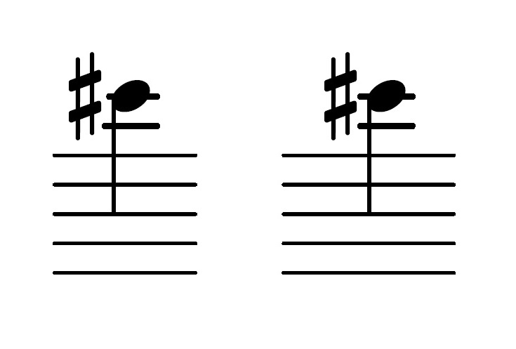
- accidentals-ledger-lines-tweak.jpg (25.33 KiB) Viewed 7846 times