Search found 439 matches
- 19 Oct 2015, 23:14
- Forum: Notation Rules and Standards
- Topic: Spacing proportions and settings
- Replies: 34
- Views: 47872
Re: Spacing proportions and settings
You can use different algorithms in the same file via the note spacing plug-in: Great! I had never installed that one I guess. Something else to mess around with tonight. I tried to see what would happen if I fed the Sibelius allotment settings into Finale. There are clearly some other factors at p...
- 19 Oct 2015, 21:56
- Forum: Notation Rules and Standards
- Topic: Spacing proportions and settings
- Replies: 34
- Views: 47872
Re: Spacing proportions and settings
I've used 1.618 for over 15 years at this point, but I might prefer 1.5 too. I've always liked the look of SCORE's output, and looking at this I think that might be what it used.Knut wrote:Interesting!
For me it's definitely between 1.414 and 1.5. Kind of a toss-up, but I might prefer 1.5, actually.
- 19 Oct 2015, 21:38
- Forum: Notation Rules and Standards
- Topic: Spacing proportions and settings
- Replies: 34
- Views: 47872
Re: Spacing proportions and settings
Ok, here's a look at some scaling values I've heard mentioned before. I'm pretty sure we can all agree the values 1 and 2 aren't acceptable options, so everyone's preference must lie somewhere in between. Scaling Factors.jpg 1.5 to 1.618 look the best to me I think. As mentioned in the original post...
- 19 Oct 2015, 19:25
- Forum: Notation Rules and Standards
- Topic: Algorithms of accidental spacings
- Replies: 37
- Views: 39604
Re: Algorithms of accidental spacings
Actually, your example looks best to me. I see you have emboldened lines, haven't you? Thanks! Yeah, they are a bit thicker than the default. Barlines and ledger lines are 25% thicker than the staff lines or something too. Most of those settings I haven't changed in a really long time though, proba...
- 19 Oct 2015, 19:06
- Forum: Notation Rules and Standards
- Topic: Spacing proportions and settings
- Replies: 34
- Views: 47872
Re: Spacing proportions and settings
I might be wrong, but I suspect that's what they were going for but not using a fixed ratio. Some built in kind of randomness that makes it more humanistic.John Ruggero wrote:Both Sibelius versions remind me of the spacing that happens intuitively when copying by hand.
- 19 Oct 2015, 19:01
- Forum: Notation Rules and Standards
- Topic: Spacing proportions and settings
- Replies: 34
- Views: 47872
Re: Spacing proportions and settings
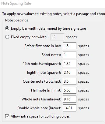
If anyone is interested, all I did for the Sib spacing was keep the quarter as the reference width, and then adjust the values so every time the duration doubles, the allotted width increases by 1.618.
- 19 Oct 2015, 17:06
- Forum: Notation Rules and Standards
- Topic: Algorithms of accidental spacings
- Replies: 37
- Views: 39604
Re: Algorithms of accidental spacings
I often turn off spacing for ledger lines and tweak where necessary. Yeah, that's generally what I do too. Once I'm to the layout phase and I've done some global spacing, I uncheck Automatic Music Spacing and tweak things by hand. For a really tough bar, sometimes I've had to turn on Avoid Collisio...
- 19 Oct 2015, 16:42
- Forum: Notation Rules and Standards
- Topic: Spacing proportions and settings
- Replies: 34
- Views: 47872
Re: Spacing proportions and settings
Also, here it is with my Golden Mean based settings for Sibelius. They are pretty much identical in terms of spacing, so this is easy to do in Sibelius. I'm just curious if people prefer the look of it over the default more "humanistic" approach.
- Fin vs Sib My Spacing.jpg (66.93 KiB) Viewed 12077 times
- 19 Oct 2015, 16:35
- Forum: Notation Rules and Standards
- Topic: Spacing proportions and settings
- Replies: 34
- Views: 47872
Re: Spacing proportions and settings
Bringing it back to the original post, here are some random eighth, quarter, and half rhythms from both Sibelius and Finale. While different, quite honestly they both look pretty good. The measure that sticks out for me is the 4th, especially in relation to the 3rd. Sib seems to give a lot more spac...
- 19 Oct 2015, 15:56
- Forum: Type and Font Design
- Topic: Clef design comparision
- Replies: 102
- Views: 121725
Re: Clef design comparision
+1, I agree.Knut wrote:In light of the earlier discussion on rotation, number three from the left is the best one to me.