Dear friends,
I haven't participated for a long time at this holly place, however I follow almost every day and most of the subjects you discuss.
With this post, I would like to share my humble experience related to this problem without any, even modest pretension that I am going to post now something distinctive. Not at all.
Slanted tremolos are definitely needed as an element in order one to prepare a good looking score.
Many of us use to generate custom fonts for such needs. So did I. The only issue is to find the balance with the real world and to decide how many elements are necessary. I put into practice just 3 attempts and the last one worked for me. The crucial thing in all of them was the width of the elements (no matter single, double or tripple tremolo symbol). Even the angle of the slant was less important. Finally I found that the width of the element for the tremolo should be equal to the width of the quarter note head. This was the meeting point where my aesthetically needs obtained complete satisfaction.
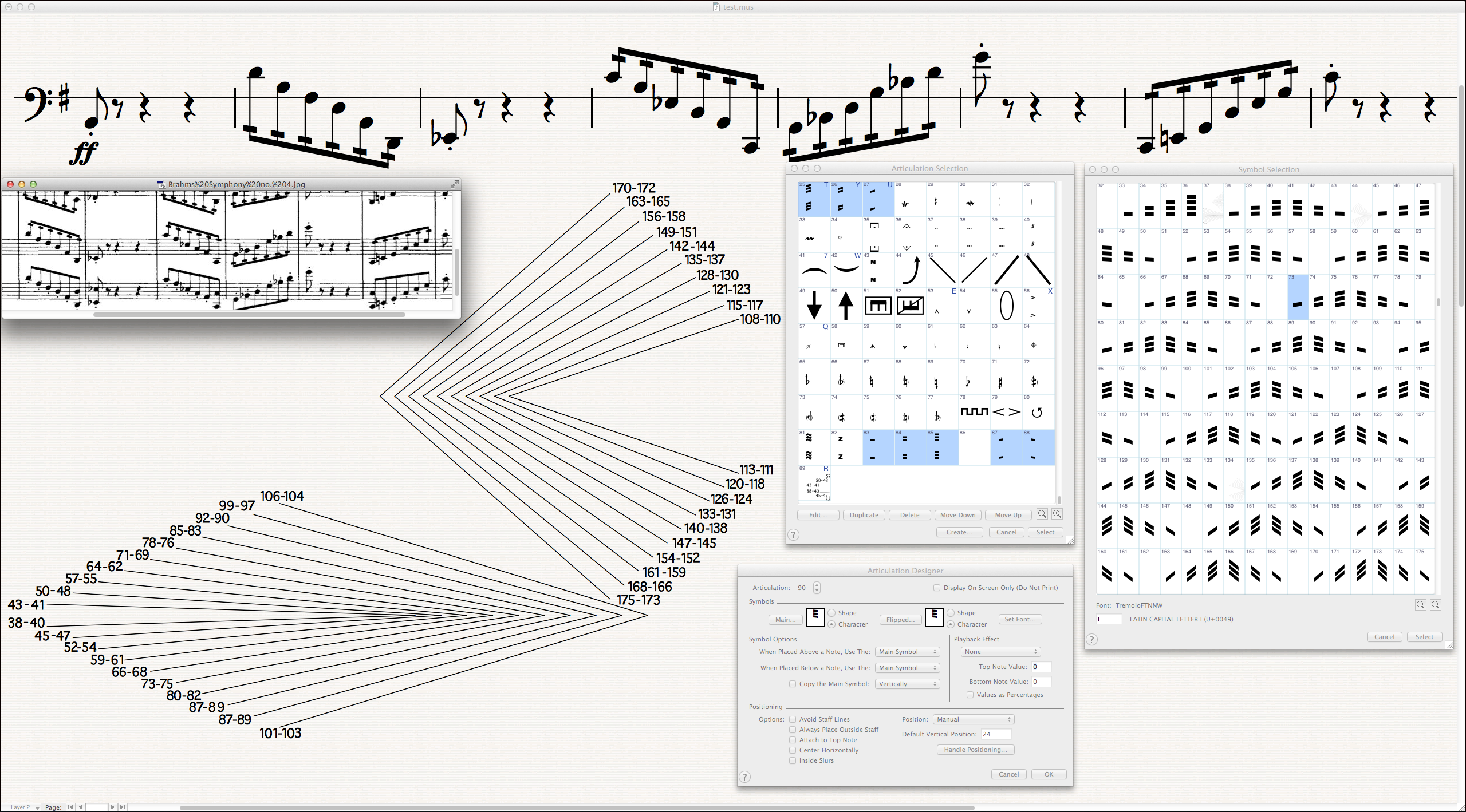
I prepared two sets of tremolos each with 10 different slants.
They are approximately + (plus) and – (minus) 1.7º, 3.5º, 5.2º, 6.9º, 8.7º, 10.3º, 12.0º, 13.7º, 15.3º and 16.9º
The second set is less usable due to its very steep slope: 18.6º, 21.6º, 24.5º, 27.3º, 30.0º, 32.5º, 35.0º, 37.2º, 39.4º, 41.3º.
Each instance has 6 derivates — single (left and right slanted), double (also left and right) and tripple (the same)
In this case I had to fill all an all 120 slots in a new font.
The biggest problem would be to find which one have to be selected when is required? Shell I try this one or that one?
Of course, not. The hesitation is my biggest enemy.
Therefore I prepared kind of ruler within the font with all different angles.
My philosophy reads: The precision does not contradict with the approximation.
Even more – we could not predict the software to generate beams with only 10 or some more fixed slants. But we could slightly manipulate the beam angles afterwards. The differences compare to the original are negligible.
To illustrate my idea, I will upload screen shots.
On one of them I overlapped the original cello part of the sample. The angles of the beams (as appeared) are as follow: 17.1º 15.2º 11.8º 13.0º.
There is no doubt, that if one of us must copy this exactly as it is, this will be time consuming work. Finale (Patterson beams plug-in) slanted all groups on ca. 8.7º and I find them more suitable for me.
Here are the samples.
The ruler is a glyph – also part of the font. In this situation its size (within Articulation tool) is 255p
I use it only for reference. How it works: if the slanted beam is touched with the appropriate "line" it refers to which slot in the font are the necessary tremolo elects. In this case there is no need to experiment. Even slightly different slanted tremolo (however close to the angle of the beam) doesn't appear improperly.
Best regards,
Wess
- Slant 8.7º.png (1.13 MiB) Viewed 13890 times

- Slant 8.7º – all beams.png (160.71 KiB) Viewed 13890 times
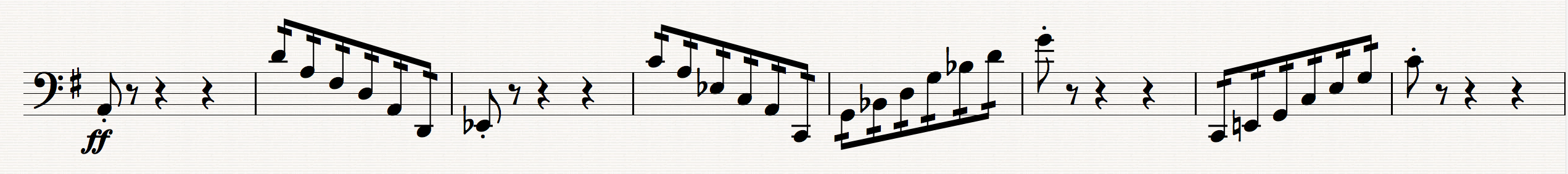
- Original beams — slant 17.1º 15.2º 11.8º 13.0º.png (177.34 KiB) Viewed 13890 times

- Overlaping.png (351.56 KiB) Viewed 13890 times