Page 3 of 4
Re: Community creates a textual font
Posted: 13 Nov 2019, 09:12
by OCTO
I have got the source of OldStandard.
I will try to recreate it again, further the next version.
Re: Community creates a textual font
Posted: 13 Nov 2019, 10:03
by odod
OCTO wrote: ↑12 Nov 2019, 14:10
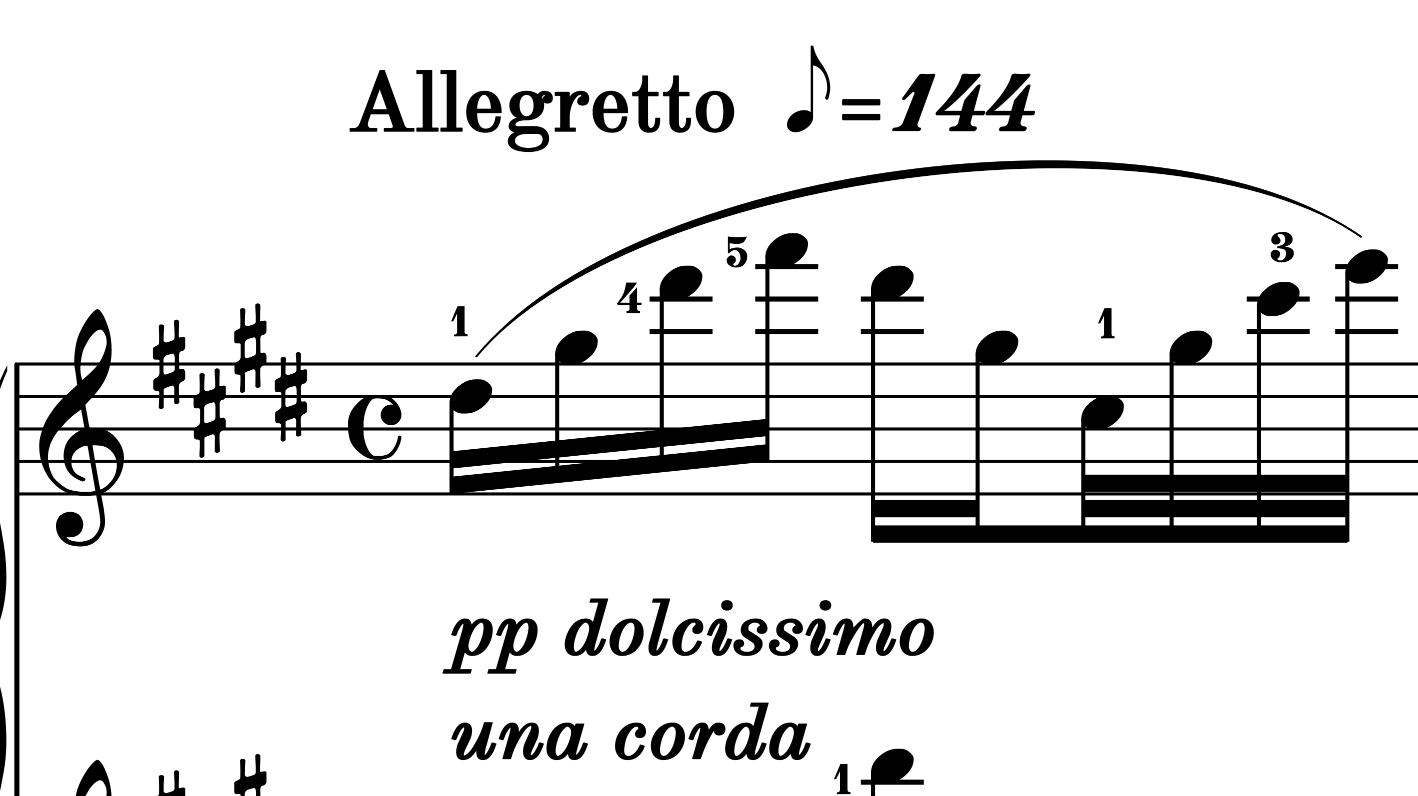
I have edited Old Standard, easy emboldened. Let me know what you think.
well done OCTO,
it looks bold on the score, here it is and look at the "g" letter i think it is close with the rounded pony tail

- JEux Deux_0001.png (192.5 KiB) Viewed 14694 times
Re: Community creates a textual font
Posted: 13 Nov 2019, 10:58
by OCTO
odod wrote: ↑13 Nov 2019, 10:03
OCTO wrote: ↑12 Nov 2019, 14:10
I have edited Old Standard, easy emboldened. Let me know what you think.
well done OCTO,
it looks bold on the score, here it is and look at the "g" letter i think it is close with the rounded pony tail
JEux Deux_0001.png
You think it is to bold?
The bold version of the font has to black-white contrast.
Yes, the g letter should be fixed! Thanks.
Re: Community creates a textual font
Posted: 13 Nov 2019, 12:43
by MalteM
The letter f needs some work too: The lower serif is too low (compare with hmnr), also the horizontal bars of t and f don’t align.
Re: Community creates a textual font
Posted: 15 Nov 2019, 11:46
by OCTO
Here is another try. For those who have installed the font, please delete the old version before installing this new.
Comments appreciated!
Re: Community creates a textual font
Posted: 15 Nov 2019, 17:03
by OCTO
Actually this task is much harder than what I expected.
Any suggestions how to embolden a font properly is welcome.
Re: Community creates a textual font
Posted: 18 Nov 2019, 17:59
by Florian
OCTO wrote: ↑15 Nov 2019, 17:03
Actually this task is much harder than what I expected.
Any suggestions how to embolden a font properly is welcome.
There’s a reason why you can get a university degree in type design.
Don’t expect Fontforge’s automatic weight conversion do get you anywhere near a usable result. Properly changing the weight of a typeface is essentially a complete redesign. Once you have two different weights you can start interpolating – modern font editors come with great tools in that regard. But you need these two starting points, and that means careful work, glyph by glyph.
Re: Community creates a textual font
Posted: 20 Nov 2019, 08:13
by OCTO
Florian wrote: ↑18 Nov 2019, 17:59
OCTO wrote: ↑15 Nov 2019, 17:03
Actually this task is much harder than what I expected.
Any suggestions how to embolden a font properly is welcome.
There’s a reason why you can get a university degree in type design.
Don’t expect Fontforge’s automatic weight conversion do get you anywhere near a usable result. Properly changing the weight of a typeface is essentially a complete redesign. Once you have two different weights you can start interpolating – modern font editors come with great tools in that regard. But you need these two starting points, and that means careful work, glyph by glyph.
Wonderful, thank you.
Indeed I feel now as a grave amateur in that regard...
If I may ask, what does "interpolating" mean?
Re: Community creates a textual font
Posted: 20 Nov 2019, 16:59
by composerjk
OCTO wrote: ↑20 Nov 2019, 08:13
If I may ask, what does "interpolating" mean?
Interpolating is determining designs through calculations between two other compatible designs. We often refer to using multiple masters for this. A type designer draws at least two masters, e.g., a light and a heavy. Each glyph would have the same number and type of nodes. Then, the in-between weights, for example, might be generated using those masters.
Perhaps the Glyphs
Multiple Masters tutorial might help in understanding this.
Re: Community creates a textual font
Posted: 20 Nov 2019, 17:22
by liuscorne
Luc de Groot (one the best type designers around) has a whole theory of how interpolation works:
https://www.lucasfonts.com/learn/interpolation-theory
https://www.youtube.com/watch?v=I75Efo7whrs
The following page has a nice visual aid to demonstrate how the outlines of a particular font change depending on the font weight. It's much more complicated than simply "boldening" an existing font weight (and it involves the same kind of mathematics needed for interpolation):
http://metapolator.com/home/