
Is it possible to share some examples of the current work?
Interestingly, MuseScore develops so quick, I wonder if it will take over Dorico!
Musescore 3.5.0.13199
Re: Musescore 3.5.0.13199
Finale 27.5 • Sibelius 2024.3• MuseScore 4+ • Logic Pro X+ • Ableton Live 12+ • Digital Performer 11 /// MacOS Monterey (secondary in use systems: Fedora 35, Windows 10)
-
oktophonie
- Posts: 12
- Joined: 02 May 2020, 11:57
- Location: Edinburgh
Re: Musescore 3.5.0.13199
Here's a page showing 3.6 in action. This is pretty much "out of the box" as far as settings go, so there's plenty wrong here, and obviously one could spend ages tweaking things to get them to look correct; but those are big problems to solve in code, in future versions. (Slurs are an obvious target, and the horizontal spacing overall.)
We have big plans and no lack of ambition, so we're aiming at a level at least as high as Dorico is; quite a lot of work needed to get there, though
We have big plans and no lack of ambition, so we're aiming at a level at least as high as Dorico is; quite a lot of work needed to get there, though
- Attachments
-
- SCHOENBERG Drei Klavierstuecke, Op 11.pdf
- (51.51 KiB) Downloaded 500 times

Re: Musescore 3.5.0.13199
And here's my font .. it is not Partita, i made it long time a go based on Barenreiter edition which obvious that they're using Finale or SCORE
sorry for some missing accidentals and marking .. just for comparison sake
Sibelius
Musescore
sorry for some missing accidentals and marking .. just for comparison sake
Sibelius
- Klavierstucke.png (1.36 MiB) Viewed 11422 times
- Drei_Klavierstuecke_Op._11 - Full Score-1.png (647.34 KiB) Viewed 11343 times
Last edited by odod on 16 Dec 2020, 15:14, edited 3 times in total.
Nuendo 12, FL Studio 20, Reaper 6, Dorico, Sibelius, HOOPUS, Pianoteq 6, Ivory II, Slate, Plugin Alliance, Soundtoys, and yeah i am a gear slut
Serenade Music Engraving Service
Serenade Music Engraving Service
-
oktophonie
- Posts: 12
- Joined: 02 May 2020, 11:57
- Location: Edinburgh
Re: Musescore 3.5.0.13199
Very nice, and pretty SCORE-faithful!
Bärenreiter no longer use SCORE for new publications but it looks like for most of their scores now they use a font (presumably Partita) to give the impression that they still are. Not often especially well engraved, though a bigger problem is their editorial standards these days. (But that's another story, grumble grumble.)
Bärenreiter no longer use SCORE for new publications but it looks like for most of their scores now they use a font (presumably Partita) to give the impression that they still are. Not often especially well engraved, though a bigger problem is their editorial standards these days. (But that's another story, grumble grumble.)
Re: Musescore 3.5.0.13199
anyway i teach my secondary students with Musescore, they really love it!oktophonie wrote: ↑15 Dec 2020, 13:13 Very nice, and pretty SCORE-faithful!
Bärenreiter no longer use SCORE for new publications but it looks like for most of their scores now they use a font (presumably Partita) to give the impression that they still are. Not often especially well engraved, though a bigger problem is their editorial standards these days. (But that's another story, grumble grumble.)
Nuendo 12, FL Studio 20, Reaper 6, Dorico, Sibelius, HOOPUS, Pianoteq 6, Ivory II, Slate, Plugin Alliance, Soundtoys, and yeah i am a gear slut
Serenade Music Engraving Service
Serenade Music Engraving Service
Re: Musescore 3.5.0.13199
If I may comment in general. In the case you agree with me or believe that my comment is not applicable, I apologise in advance.oktophonie wrote: ↑15 Dec 2020, 07:30 Here's a page showing 3.6 in action. This is pretty much "out of the box" as far as settings go, so there's plenty wrong here, and obviously one could spend ages tweaking things to get them to look correct; but those are big problems to solve in code, in future versions. (Slurs are an obvious target, and the horizontal spacing overall.)
We have big plans and no lack of ambition, so we're aiming at a level at least as high as Dorico is; quite a lot of work needed to get there, though
The most common misunderstanding is that the bigger symbol = the faster perception. This happened with Engraver font and with so called Maestro Wide. These fonts are actually very hard to use (at 24 p), since they occupy very large horizontal spacing. The wider horizontal spacing = more space needed = more wide music is = more difficult to read. It is like having words or letters to far away. Engraver occupy also to much vertical space (
Something similar I find in Feta (particularly older version): the natural symbol
Well, how to construct a good font? I believe everything is in a proper balance: B/W balance of each symbol, and balance between all symbols together. I stress the word Black/White balance, it means that none of symbols will stand out to much, none will occupy to much information, none will disappear = only one dimension, not several; every symbol needs to feel as stapled or punched on printed score.
Several years ago, when I was teaching music theory and ear training, I had a good opportunity to test various fonts in order to use for my material the "best" one. Well, what is the best font?
Simply, I printed the same music material in different fonts, and gave it to students. First I did't tell them there are different fonts, but toward the end of the lesson I asked them to look carefully and to give their "score": what is easier to read? That font I used later in my publications.
But to clarify this: a font for ear training is not the same as font for orchestral music read from distance, and is not the same as "on screen" font for mobile applications.
The result is that I used SCORE-like fonts for all my publications in the first place, and Maestro in the second.
Finale 27.5 • Sibelius 2024.3• MuseScore 4+ • Logic Pro X+ • Ableton Live 12+ • Digital Performer 11 /// MacOS Monterey (secondary in use systems: Fedora 35, Windows 10)
-
oktophonie
- Posts: 12
- Joined: 02 May 2020, 11:57
- Location: Edinburgh
Re: Musescore 3.5.0.13199
Totally agreed. I often felt SCORE worked better in orchestral music (i.e. at a small size) than for piano music, though actually this is as much as anything to do with the line width setting in SCORE, which is often carelessly handled - I've seen lots of orchestral scores which are too heavy and piano or chamber music that's too light. Because the symbols are all drawn as vectors rather than being fixed font symbols, this same setting also affects the width of all the strokes - not just stave lines and such - so it really makes a big difference.
Re: Musescore 3.5.0.13199
I don't know why, but MuseScore looks much better. Spacing and design look more natural to me.
Finale 27.5 • Sibelius 2024.3• MuseScore 4+ • Logic Pro X+ • Ableton Live 12+ • Digital Performer 11 /// MacOS Monterey (secondary in use systems: Fedora 35, Windows 10)
Re: Musescore 3.5.0.13199
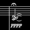
Interestingly, the Opus font for Sibelius uses individual letters for dynamics, and the kerning and design are such that they fit together perfectly for pppp and fffff.
I actually don't like a ligature between m and p. It looks ugly in a lot of fonts, and gets in the way of the eye movement across the two letters.
Maestro is 'good in parts, my lord'. But there are a few bits here and there that I really find hideous. It's a shame they seem to have abandoned their SMuFL implementation.
-
oktophonie
- Posts: 12
- Joined: 02 May 2020, 11:57
- Location: Edinburgh
Re: Musescore 3.5.0.13199
Yes, I never liked the mp ligature either and was a bit surprised to see it in Bravura. (Of course, mp is a bit of a nonsense dynamic anyway, as Berio used to say, but that's another matter)