Page 3 of 7
Re: Espressivo font
Posted: 22 Dec 2015, 23:04
by wess-music
Hi John,
I have no idea why the screen shots appeared in reverse order – Nº4 is 1, 3-2, 2-3, 1-4.
Any way.
About the peddling – long, very long ago I stopped sending my critics to some composers that I work with. Everyone knows why and must take its own responsibility. However, I can't agree more with you about pedalling.
"sempre ppp (Echo)" – could be really better aligned, indeed. Thank you spotting this.
Re: Espressivo font
Posted: 23 Dec 2015, 00:23
by RMK
About the peddling – long, very long ago I stopped sending my critics to some composers that I work with. Everyone knows why and must take its own responsibility
Very wise advice. I wish I had taken it about 20 years ago!
Re: Espressivo font
Posted: 23 Dec 2015, 15:21
by John Ruggero
Wess, I am sorry that some of these composers don't know good advice when they hear it.
Re: Espressivo font
Posted: 23 Dec 2015, 19:38
by OCTO
John Ruggero wrote:OCTO, is your screen shot a suggestion for improvement?
It is actually not a suggestion but my fascination by Wess' engraving virtuosity...
Re: Espressivo font
Posted: 24 Dec 2015, 02:55
by John Ruggero
Thank you, OCTO. Wess's subtleties sometimes go right over my head. It must be the broken slur that you admire. But as much as I admire Wess's incredible work, I still don't like slurs and accidentals intersecting, even if broken. To me a slur is unbroken because it represents something unbroken: the unbroken connection between the notes.
Re: Espressivo font
Posted: 26 Dec 2015, 15:26
by Knut
John Ruggero wrote:To me a slur is unbroken because it represents something unbroken: the unbroken connection between the notes.
I totally agree!
Re: Espressivo font
Posted: 03 Jan 2016, 18:06
by Knut
Inspired by Wess' excellent italic font, I've begun more serious work on my own version, meant to complement dynamics, Octave signs and tuplet numbers in the music font, and fit together well with Century style serifs. I'll post more samples when the basic capitals are all done. For now, here's a small sample of the beginnings.
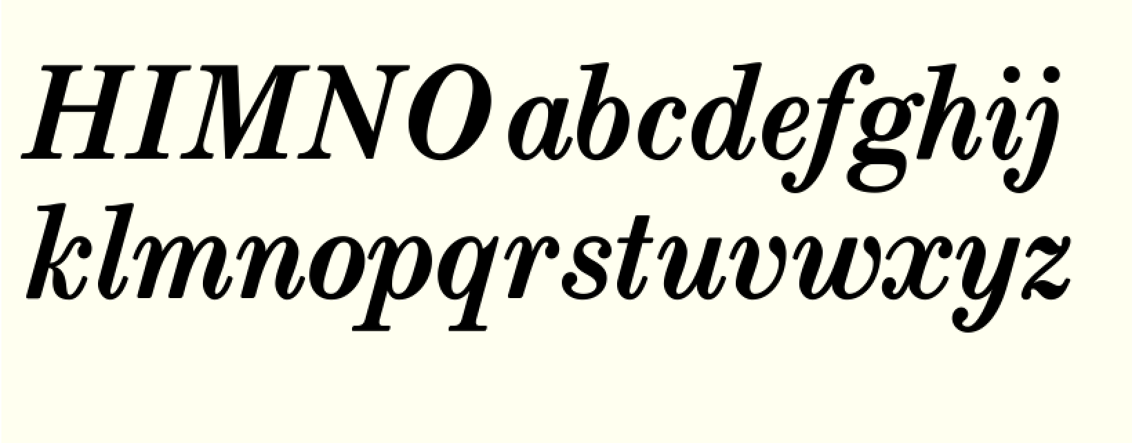
- Skjermbilde 2016-01-03 kl. 18.54.07.png (123.84 KiB) Viewed 16461 times
Thanks, Wess, for the inspiration!
Re: Espressivo font
Posted: 04 Jan 2016, 08:22
by OCTO
Very nice Knut!
Can you put it in a context?
Re: Espressivo font
Posted: 04 Jan 2016, 15:17
by Knut
OCTO wrote:Very nice Knut!
Can you put it in a context?
Thanks, OCTO!
As I said I will post more samples when the basic character set is done, and I'm free to write any text necessary. For now, since you're a Violinist, here's a couple of examples from Tzigane by Ravel:
The first one is the beginning (with an
expressif marking not originally placed at the beginning), so you may compare different font styles. The regular styles featured are New Century Schoolbook, a likely pairing with this kind of italic.
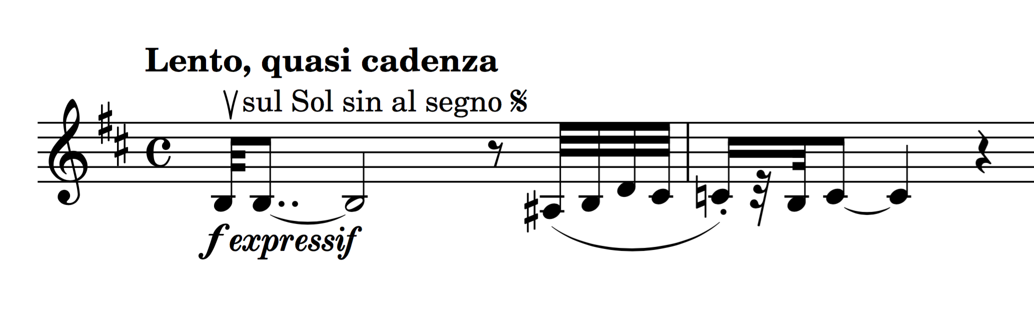
- Skjermbilde 2016-01-04 kl. 15.47.18.png (167.86 KiB) Viewed 16424 times
The second example shows the fairly important size and line width in relation to a composite dynamic. Notice that my primary dynamics (

and

) are bold, while the secondary dynamic characters, like

,

and

, are of the same semibold weight as the italic font. This is a not uncommon feature in many publications, and a nice way of making the italic font blend in with the dynamic symbols, considering the inherent size differences of primary and secondary dynamic characters.
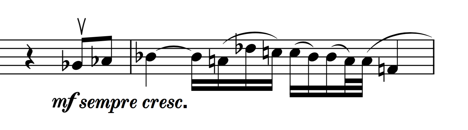
- Skjermbilde 2016-01-04 kl. 15.59.42.png (87.7 KiB) Viewed 16424 times
Re: Espressivo font
Posted: 05 Jan 2016, 05:56
by OCTO
Looks well!
Two things: I think that thin lines are to thin or to say, bold are to bold. Something in-between for my taste I would like more...
Another: what if you have the accidentals somehow bigger, if 24, try with 25 or 26. Just as a test.