Page 5 of 11
Re: Clef design comparision
Posted: 12 Nov 2015, 14:56
by wess-music
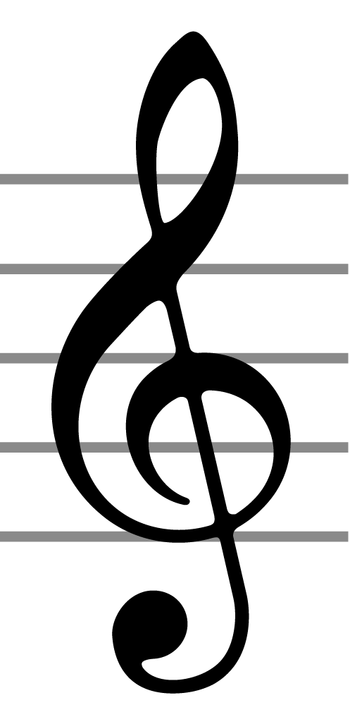
And now I would like to share with you guys, my favourite G-clef.

- G-clef Font Vintage 3.png (33.64 KiB) Viewed 14330 times
______________________________
Can you guess who is the publisher?
BTW, the staff lines drawn in grey are very, really very close to the original (as width) —> 0.09 — 0.114 space.
______________________________
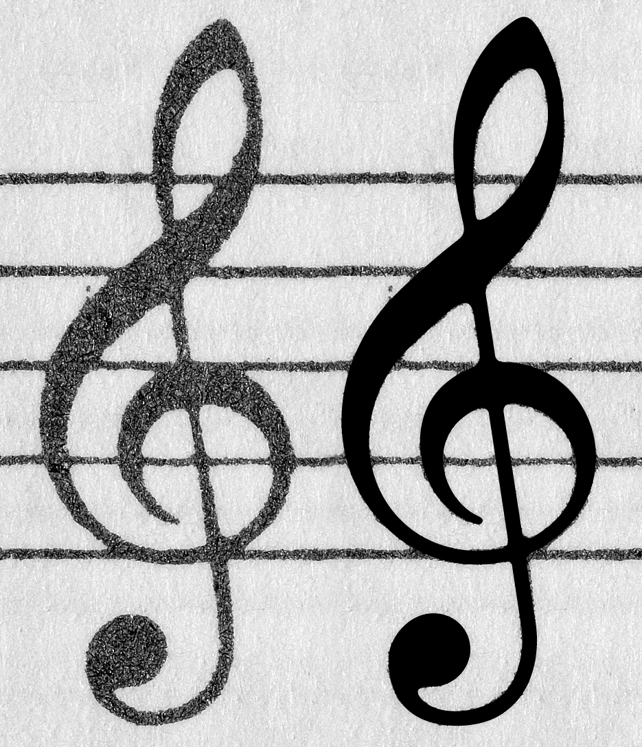
Here are both clef side by side.
The one used in my font is a bit rotated. Consider it as a kind of ... caprice!
No, Of course, not! The reason for this variation is because all other clefs from this art was slightly rotated to the left, but this one was perfectly printed and I use it as a "model".

- G-Clef.jpg (751.61 KiB) Viewed 14326 times
Behind the black digitalised cloning are seen the edges from the original (placed on the background) for reference.
Best regards,
Wess
Re: Clef design comparision
Posted: 12 Nov 2015, 15:02
by Knut
Nice clef. Peters?
Re: Clef design comparision
Posted: 12 Nov 2015, 17:26
by wess-music
Unbelievable, but it's Henle.
Re: Clef design comparision
Posted: 12 Nov 2015, 20:31
by Knut
Really! I can see that based on the modest thickness of the strokes. Is this the clef from their old house style?
Re: Clef design comparision
Posted: 12 Nov 2015, 21:57
by wess-music
Knut,
I will check tomorrow the year and the composition. My suspicious are that it was from some piano work.
It might turn out to be from some late 70, even 90. But I need to open my archives and to find it.
Till tomorrow!
Best regards,
Wess
Re: Clef design comparision
Posted: 13 Nov 2015, 06:59
by OCTO
I like this much more than the current Henle's

.
Re: Clef design comparision
Posted: 13 Nov 2015, 13:45
by wess-music
OCTO wrote:I like this much more than the current Henle's

.
So do I, OCTO.
Re: Clef design comparision
Posted: 13 Nov 2015, 14:05
by Knut
While this clef is nice, and much closer to my own design, I very much like the current Henle clef on the basis of identity. The clef above is much more generic, while the current one, like many other aspect of their scores, is instantly recognizable. This is the only reason why I would never copy Henle's look as the basis for a music font. It's much too distinct in my opinion.
Re: Clef design comparision
Posted: 13 Nov 2015, 14:31
by wess-music
Knut wrote:Really! I can see that based on the modest thickness of the strokes. Is this the clef from their old house style?
As I promised last night:
Here is the information:
This G-clef might be found in
:
A:
2007 – Bach, Das Wohltemperierte Klavier
B:
1983 – Some works from Schubert
Re: Clef design comparision
Posted: 13 Nov 2015, 14:41
by Knut
Thank you, Wess!
I find it strange though, that my copy of Henle's 2007 edition of WK uses the other clef style.
I would have thought that the clef we've been referring to as the 'current' treble clef would be used exclusively. Apparently that's not the case.