So I did a little experimenting, trying to come up with a sans serif music font and testing whether it looked more "contemporary". Easier said than done.
First thing I noticed is that there are different classes of music symbols that react differently to the attempt of making a sans serif version of it.
(1)


and, of course, time signatures: They are easily turned into sans serifs, just draw a basic skeleton of the symbol and apply a constant stroke width, come up with a solution for the ball terminals, done! You may not like my version presented below (that is totally understandable, I don't really like it either), but in principle it is pretty straight forward.
(2)


: I tried to come up with a version that reduced the difference in stroke width between horizontal and vertical lines – and failed. I is either harder to read or too prominent on the page. So all I did was to draw a "clean" version of the traditional symbols, which looks pretty much the same on the page.
(3) Note heads: Again, very tricky. You either change the appearance and make it harder to read, or you are stuck with the traditional symbol. (All I did was making my traditional symbols a little rounder and the counters of those symbols a little more geometrical. The difference is not prominent on the page.)
(4) Flags: Weirdly, in my own music font they are already "sans serif", there is not much difference in stroke width. Again, I cleaned up the symbols slightly, but it's hardly noticeable.
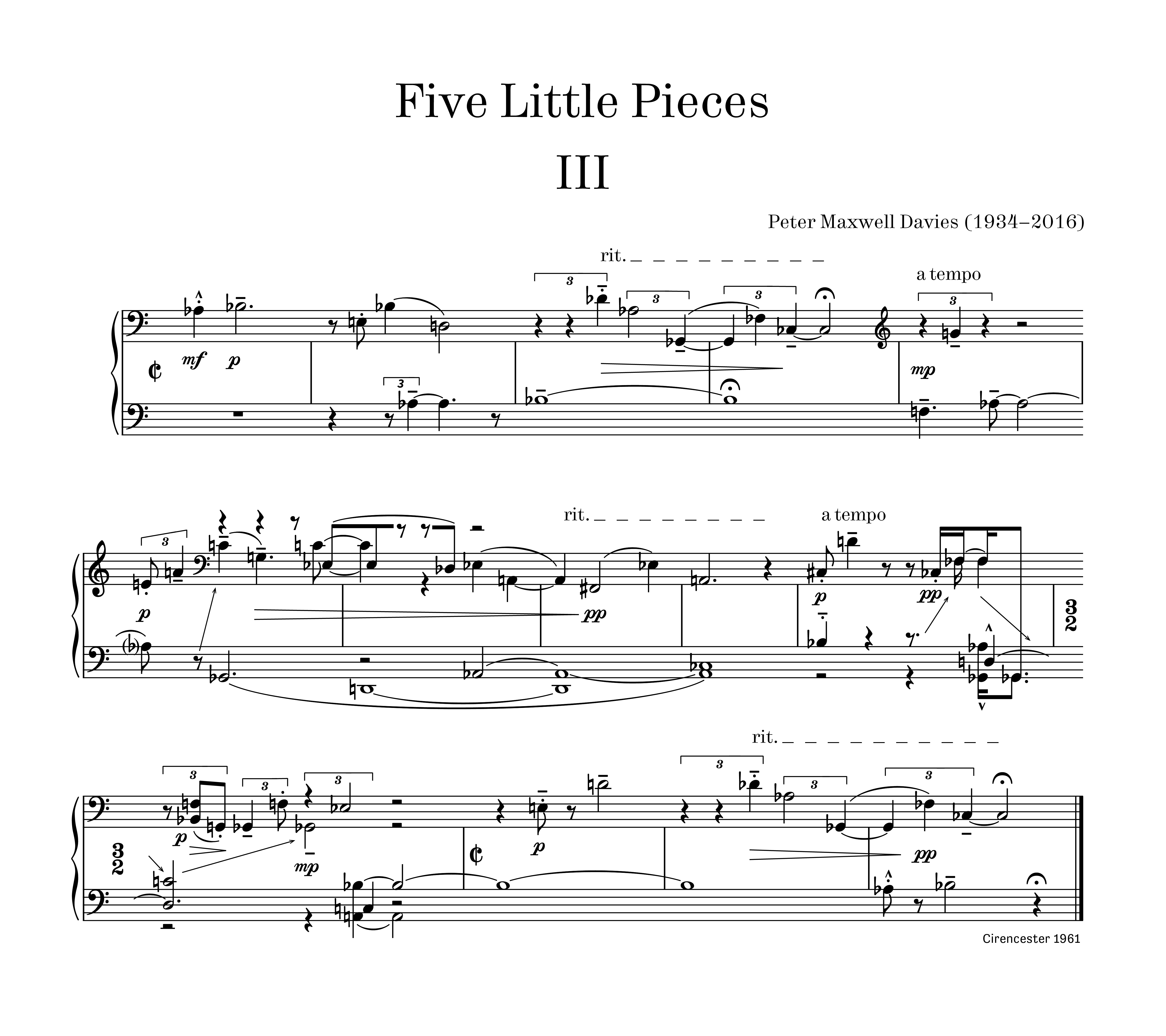
In order to test the result I used one of the "Five Little Pieces" for piano by Peter Maxwell Davies.
The
first example shows "old style" engraving (my own music font based on Peters editions, Hercules for text elements). All engraving choices are taken from my Boosey & Hawkes edition.
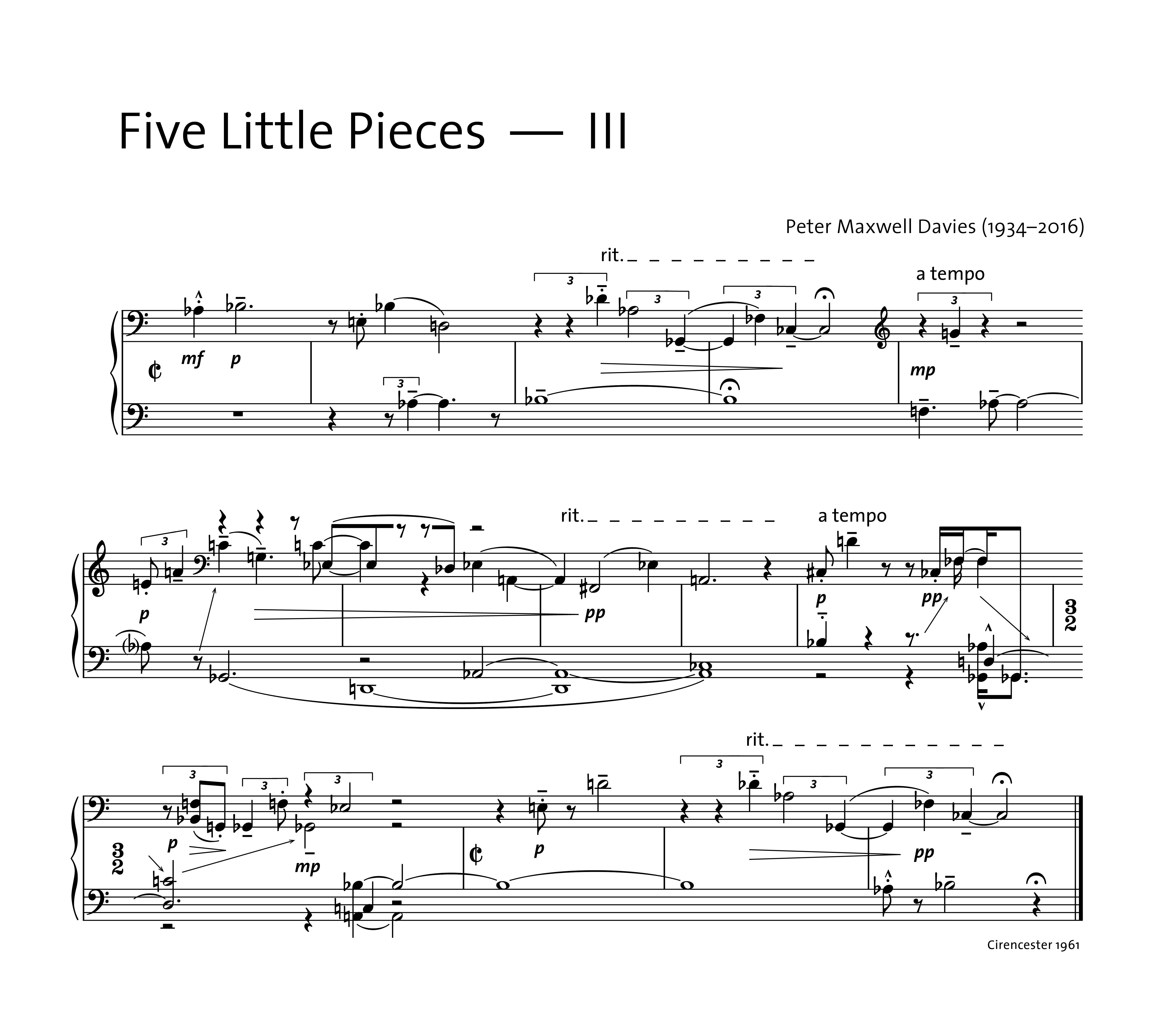
The
second example uses the same music font, but Thesis Sans for title etc. and also for dynamic and tempo markings. The page does have a different feel to it. Whether this is accurately described as "more contemporary" is another question. But it looks different, even though the music font is the same.
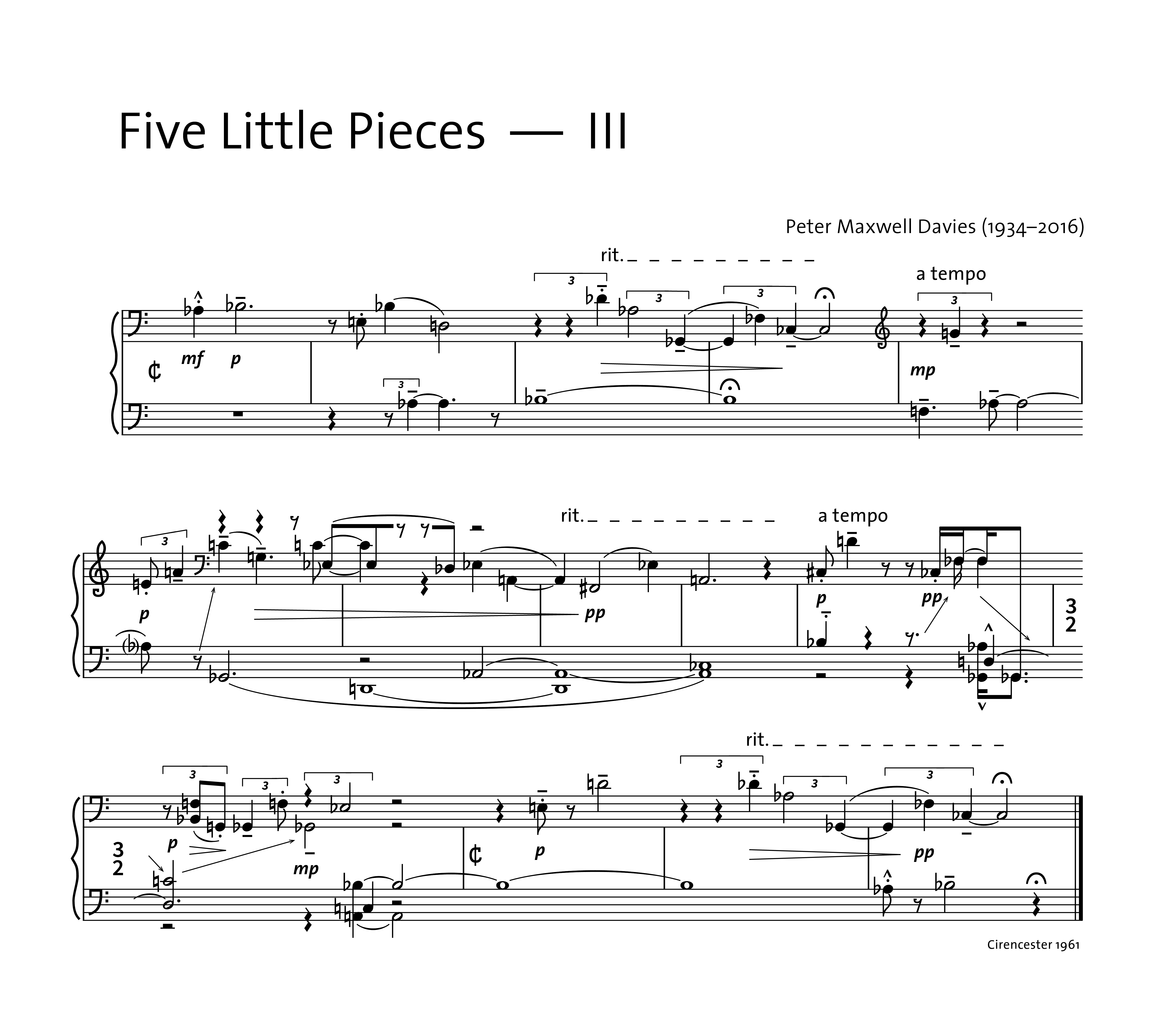
The
third example uses the sans serif music font described above (in addition to the Thesis Sans text font). To me, it doesn't feel much different from the second example, certainly not more or less "contemporary". I looks like a slightly weird version of traditional engraving.
From this little experiment I conclude that, as long as you want to keep your music font readable (and therefore close to traditional engraving), it is hard to come up with a sans serif music font that has an influence on the overall feel of the printed page. The choice of TEXT FONT seems to have a much greater impact in that regard. So to create a more "contemporary" score one shouldn't focus too much on the music symbols and more on the overall design of the page and the use of text within a score.
- sans serif test__example 1.png (628.97 KiB) Viewed 21963 times
- sans serif test__example 2.png (605.5 KiB) Viewed 21963 times
- sans serif test__example 3.png (579.91 KiB) Viewed 21963 times