Knut, please allow me to respond to your very cogent remarks with a more general statement that I think will answer your questions:
Concerning the Henle edition. The editor had access to the MS and all other primary materials. Yet we have seen in a previous thread how he diverges from the MS and 1st edition in the case of the Prelude in C# minor in terms of stem direction in spite of promises to the contrary. For this reason, I distrust this edition in matters of engraving. But it would be an excellent source for matters of divergent readings of notes between the MS and first edition.
I looked through the Henle and compared to the 1st edition, and wherever the Henle has changed the engraving, I prefer the original. For me it is like looking at something produced by knowing hands guided by musicality, i.e. the Breitkopf hand engravers, v.s. something produced by an automaton following simplistic rules because there is no genuine instinct to guide it. Cases in point:
1. Despite the extreme challenges of placing this music on two facing pages (to avoid a page turn) the Henle places the staves of each grand staff FARTHER apart to "aid reading'. This was also forced by changing the placement of the hairpins. But keyboard music that intermingles the hands in the middle of the keyboard is best spaced with the staves CLOSER together than usual, just as with alternating hands passages. This would also allow greater space between the systems, which is a much more effective strategy in helping reading on such a full page.
This can be seen by comparing the first pages of each edition. In the Henle, the eye is lost on the page because there APPEARS to be more space between the staves of each system than between the systems themselves. (This may not literally be the case.) The second page gives both engravers difficulty. But the first edition is superior because the grand staves are of various widths, which helps orientation.
Despite the challenges for the engraver in placing the dynamics etc. between the staves and resulting crowding, I find it easier to read the 1st edition The only players who would be helped by widely spaced staves are beginners who can not take in two staves at once. And this vertical "spreading" reminds me of the horizontal "spreading" seen in so much engraving now.
2. In polyphonic music on the piano, it is obviously best to place slurs closest to the voices they pertain to, which are generally the outer ones, thus the decisions in the original edition. This style of slur positioning cannot always be carried out, unfortunately, and it always bothers me in my own engraving when it cannot. Rachmaninoff often seems to use the tenuto mark as a stress mark and these are best positioned similarly.
Music like Rachmaninoff and Brahms that uses full textures requires very fine voicing, or it sounds ugly. Brahms' music was actually accused of thickness etc. before pianists realized this. This prelude should sound quite delicate and that means that the accompanying textures are to be subordinated to an extreme degree. That is why the hairpins and other markings are so intimately placed in relation to the leading voices.
3. I noticed one more egregious example of changing stem direction in the Henle. Here is the first edition:
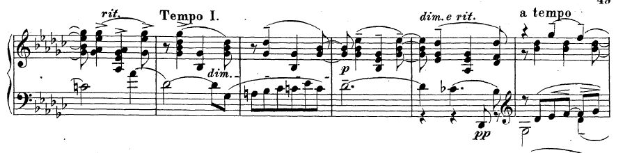
- Rachmaninoff Prelude stems.jpg (50.78 KiB) Viewed 15445 times
Note that in the 5th measure the stem direction of the melody in the LH is maintained downward to be consistent with the previous measures, but also to show that this voice leads to the downward stemmed voice in the next measure. This required giving the pizzicato Db in the bass an up stem, horrors!!!
But this up stem hints that the isolated Db has an imaginary conclusion in the next measure, i.e. a pizzicato Gb one octave lower than the written Gb! A good pianist will "suggest" that low Gb.
The Henle changes the stem direction in this voice between the bottom of the first page and top of the second (maybe they thought we wouldn't notice?). Then they add a line to show the voice leading. All of this distortion because the stem direction doesn't adhere to the pedestrian.
Knut wrote;
many of us tend to want to contribute too much to this kind of work, in an effort to 'put our own stamp on it'
In my opinion, putting an individual imprint on anything is not something that one should strive for or distortion will result. Individuality happens because personality comes out in our work almost in spite of ourselves.