Page 1 of 1
Sharps alignment in octaves - November/Sibelius
Posted: 01 Jun 2024, 09:53
by Harpsichordmaker
I am using November font with Sibelius, and I found an alignment problem with sharps in octaves, see the image.
No other font in SIbelius has this issue. I have used November2 in Dorico with no issues. November2 is somewhat different from November which is a Sibelius specific version of the same font.
Of course I have used the house style provided with the font.
Any clue/suggestions?
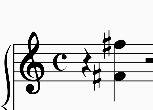
- Screenshot 2024-06-01 alle 11.39.54.png (30.23 KiB) Viewed 17549 times
Re: Sharps alignment in octaves - November/Sibelius
Posted: 01 Jun 2024, 14:43
by benwiggy
I don't know how Sibelius deals with the additional information that notation apps usually need about font glyphs -- Finale used to use "Font Annotation Files" prior to SMuFL; and of course now uses the JSON metadata files that SMuFL uses (as does Dorico).
I presume that Sibelius thinks the sharps are bigger (taller) than they really are, and is trying to avoid a collision between them.
Re: Sharps alignment in octaves - November/Sibelius
Posted: 01 Jun 2024, 18:04
by Harpsichordmaker
Probably. Is there anything I could do to fix this issue?
Re: Sharps alignment in octaves - November/Sibelius
Posted: 01 Jun 2024, 20:58
by benwiggy
I'm afraid I don't know how Sibelius can adjust these things, or if it can. But that's definitely the area to look at.
November is a really curious font -- some of the shapes are really beautifully designed and executed, with lovely rounded corners like real engraving.
But the effect is spoilt by some really poor glyphs, IMO; or at the least, ill-matched ones. Quaver flags are far too thin; that crotchet rest looks tilted; the octave numbers are very poor; and the 'p' dynamic is far too large.
Re: Sharps alignment in octaves - November/Sibelius
Posted: 04 Jun 2024, 12:03
by Harpsichordmaker
Thank you Ben.
Sibelius can adjust alterations left-right position very easily, so it's something I can fix in a snap. I was wondering how a so fine font has such drawback. However, the manual coming with the font states very clearly that Sibelius for Windows has a bug preventing the font from reliably working under Windows, which is what i am currently using. According to the manual, no issues are to be found under MacOS. I have a Mac, so I definitely will try. I'll report here.
I noticed the very thin quaver flags, and found them annoying. Then I discovered the issue is only related to home laser printers. I had some scores printed in a true typography and they are beautiful. Maybe my laser printers (I tried on two of them) don't manage fine lines too well.
Re: Sharps alignment in octaves - November/Sibelius
Posted: 04 Jun 2024, 12:44
by Harpsichordmaker
Oddly enough, the issue is only present in "normal" octaves, i.e. when both notes are in the same voice, while the alignment of the sharps is normal when the two notes are in two different voices. Look at the picture.
Windows, Sibelius, November font.
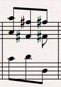
- Screenshot 2024-06-04 144031.png (17.74 KiB) Viewed 17434 times
Re: Sharps alignment in octaves - November/Sibelius
Posted: 05 Jun 2024, 23:15
by NeeraWM
The pain Sibelius daily causes to engravers trying to achieve good spacing because of accidentals should be narrated in an epic poem of, at least, 42 books... Try a fourth interval with both notes flat (:facepalm:)