Page 1 of 1
Score Modern - a text font
Posted: 26 Mar 2025, 15:54
by OCTO
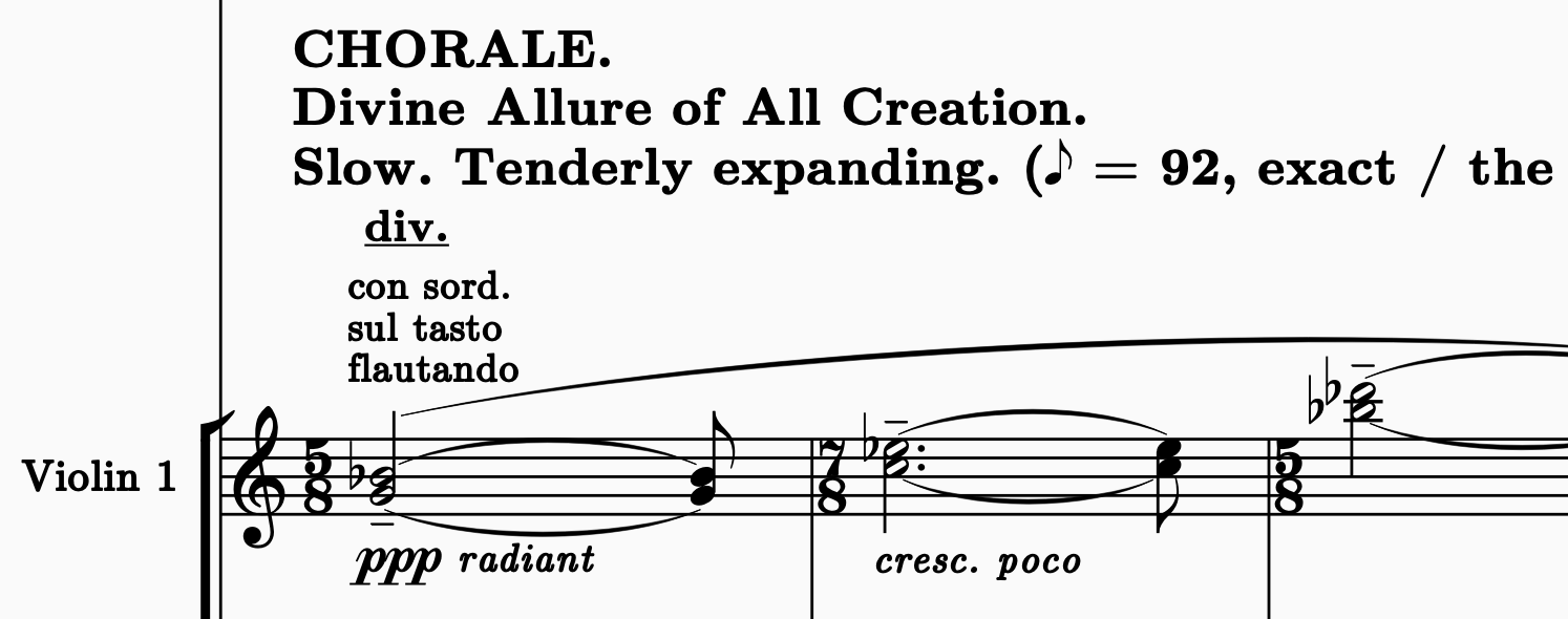
It is closely related to the main font in LaTeX, Computer Modern, thus name
Score Modern. It is designed so that it can be read from distance, somehow "punched".
It is also similar to
Old Music Standard.
I have tested it so far in Sibelius on MacOS.
Give a try and let me know what you think!
- Screenshot 2025-03-26 at 16.47.02.png (119.56 KiB) Viewed 172807 times
Re: Score Modern - a text font
Posted: 26 Mar 2025, 17:22
by hautbois baryton
I'm vacillating between really liking the noteheads and not liking them. Very clear to read!
Re: Score Modern - a text font
Posted: 26 Mar 2025, 18:58
by NorFonts
OCTO, your fonts are always on point! You’re making some seriously cool designs. I’d like to make a small tweak to the kernings. Once I’ve got it sorted, I’ll post the correction here. Many thanks.
Re: Score Modern - a text font
Posted: 26 Mar 2025, 19:11
by OCTO
NorFonts wrote: ↑26 Mar 2025, 18:58
OCTO, your fonts are always on point! You’re making some seriously cool designs. I’d like to make a small tweak to the kernings. Once I’ve got it sorted, I’ll post the correction here. Many thanks.
Do you need Font Lab files?
Re: Score Modern - a text font
Posted: 26 Mar 2025, 20:05
by NorFonts
No need for those files

Re: Score Modern - a text font
Posted: 27 Mar 2025, 19:52
by OCTO
hautbois baryton wrote: ↑26 Mar 2025, 17:22
I'm vacillating between really liking the noteheads and not liking them. Very clear to read!
Yes, I understand the feeling! I have finally come to accept it as the best half notehead shape. As far as I understand, it’s essentially derived from SCORE.
NorFonts wrote: ↑26 Mar 2025, 18:58
OCTO, your fonts are always on point! You’re making some seriously cool designs. I’d like to make a small tweak to the kernings. Once I’ve got it sorted, I’ll post the correction here. Many thanks.
It somehow reminds me of Messiaen's scores, with their bold typeface for tempo markings. I am starting to develop a love for this bold, wide typeface.
Re: Score Modern - a text font
Posted: 29 Mar 2025, 15:31
by benwiggy
OCTO wrote: ↑26 Mar 2025, 15:54
It is closely related to the main font in LaTeX, Computer Modern,
I've never been a big fan of Knuth's typeface. The Roman is a based on a Century-family typeface, and OK up to a point -- if a little mechanical -- but his other styles are terrible. The Bold is too wide, IMO. The Italic is poorly designed, and the BI is the worst of both. The spacing seems a little clinical.
Your Italic is certainly better than Knuth's. You've gone for an 'inked' heaviness in the Regular and Italic, and so your Bold versions need to be heavier. Currently, they are too similar. I'd suggest making the Bolds thicker (but not any/much wider); while holding contrast between the thick and thin strokes.
But overall, really nice! Well done.
Re: Score Modern - a text font
Posted: 04 Apr 2025, 00:06
by sugarfree
A wonderful font! There's a small misalignment in number 4.

- Screenshot 2025-04-03 at 5.01.32 PM.png (11.9 KiB) Viewed 138206 times
Re: Score Modern - a text font
Posted: 04 Apr 2025, 00:35
by sugarfree
and if I may, the kerning for the dot and the space width are too large.
- Screenshot 2025-04-03 at 5.29.19 PM.png (11 KiB) Viewed 138095 times