Page 1 of 3
SMuFL Quarter Rest Design
Posted: 25 Jul 2025, 16:56
by Fred G. Unn
A decade ago we had a nice discussion on quarter rest design here:
viewtopic.php?t=14
Since we're mostly living in SMuFL-land now, rather than continuing that thread I thought I'd just start a new one that is SMuFL specific. Notation Central had a little 25% sale on SMuFL fonts too so a few of these are pretty new to me (like 2 of them purchased today, LOL)
Below are 13 different SMuFL quarter rests, 7 of which are free and 6 I purchased.

I know they can all run together looking so many at once, but which design elements do you like? Which do you not like? (N.B. some of the designers are members here.) Do you have an overall favorite? Obviously context, harmony with other elements, visual weight on page, etc. all matter too, so I can post some musical examples for any favorites. Just curious what everyone looks for in a quarter rest and which you prefer.
Re: SMuFL Quarter Rest Design
Posted: 25 Jul 2025, 22:42
by OCTO
The rests in Finale’s Engraver font are generally quite good to me, with a nice balance between lines and curves, however slightly bolder.
From the image above, I would choose 4, 8, and 13, without trying to identify the fonts.
Re: SMuFL Quarter Rest Design
Posted: 26 Jul 2025, 11:47
by Fred G. Unn
Yeah, #4 is Engraver. I like the shape of that and that's what I used in my Finale days. Now it feels to me like it's falling forward just a bit. I guess with music it's better to be falling forwards than backwards though to help lead the eye across the page. #8 is Leland, the MuseScore default modeled after SCORE. On the page in context, it almost feels like it's leaning back to me. I figured most people here would probably be familiar with those two. #13 is sort of a trick question, so I'll explain that one when I post all the names. I was just going to wait a bit to give anyone who wants a chance to judge them blind.
Re: SMuFL Quarter Rest Design
Posted: 27 Jul 2025, 00:10
by hautbois baryton
I'm partial to #4, #6, and #11.
Re: SMuFL Quarter Rest Design
Posted: 27 Jul 2025, 11:40
by benwiggy
4 looks slightly leaning forwards, to me, compared with the ... rest.
The ones I DON'T like are 5, 7, 9, 10. I'm hoping I've guess my favourite, 12, correctly...

I'm guessing that you've put these in alphabetical order....?

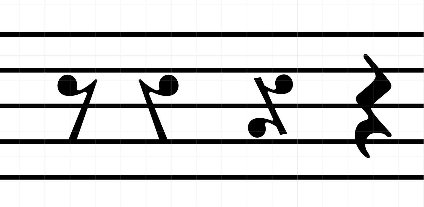
The crotchet rest is perhaps the newest of the basic symbols. Originally, it was a mirrored version of the quaver, which then became stylized with a symmetrical rounded tail; and then both tails became further stylized in different ways.
- Screenshot.png (104.98 KiB) Viewed 52733 times
For that reason, I like the rest to zigzag around the lines, and not to snap to them.
Re: SMuFL Quarter Rest Design
Posted: 27 Jul 2025, 12:29
by Fred G. Unn
benwiggy wrote: ↑27 Jul 2025, 11:40
I'm hoping I've guess my favourite, 12, correctly...
I'm guessing that you've put these in alphabetical order....?
I can't imagine you wouldn't immediately recognize #12, LOL! Yeah, except for 13, it's alphabetical order. I probably should have randomized it before posting, but I was originally doing this just as an exercise for myself. I put them in order to keep them straight, then decided to go ahead and post it here anyway.
benwiggy wrote: ↑27 Jul 2025, 11:40
The crotchet rest is perhaps the newest of the basic symbols. Originally, it was a mirrored version of the quaver, which then became stylized with a symmetrical rounded tail; and then both tails became further stylized in different ways.
I have no idea which book it's in, but in some reprint I have (1700s?) it gives the sequence of durations explicitly showing the backwards eighth rest used as a quarter rest. I had either forgotten or never knew about the style adding the additional tail, thanks! For handcopying there are a bunch of ways to do it. I think most people do it in one stroke, but I had originally been taught a three-stroke quarter rest, which actually resembles that inverted eighth with a tail a bit, so that's how I still do it, even with pencil.
Re: SMuFL Quarter Rest Design
Posted: 27 Jul 2025, 12:48
by HeiPet
I did a „research“ in my family.
My wife votes for 6, 7 and 9
My youngest son is in favour of 6, 3 and 10
My favourites are 3, 6 and 8, but one starts to see strange things, if you look at them for a longer time.

I don't like like, when the lower tip (don't know, if this is the right word for it) hits the 2nd line.
1 is probably Bravura, which fits nicely into the stronger look of the font, but looks a bit odd in this context.
Re: SMuFL Quarter Rest Design
Posted: 27 Jul 2025, 14:17
by Fred G. Unn
HeiPet wrote: ↑27 Jul 2025, 12:48
one starts to see strange things, if you look at them for a longer time.
I don't like like, when the lower tip (don't know, if this is the right word for it) hits the 2nd line.
1 is probably Bravura, which fits nicely into the stronger look of the font, but looks a bit odd in this context.
Haha, that's actually why I posted these here. I have another page of most commonly used elements in a quasi-musical context I've been using to evaluate glyphs too, but just staring at quarter rests does get a bit odd after a while.
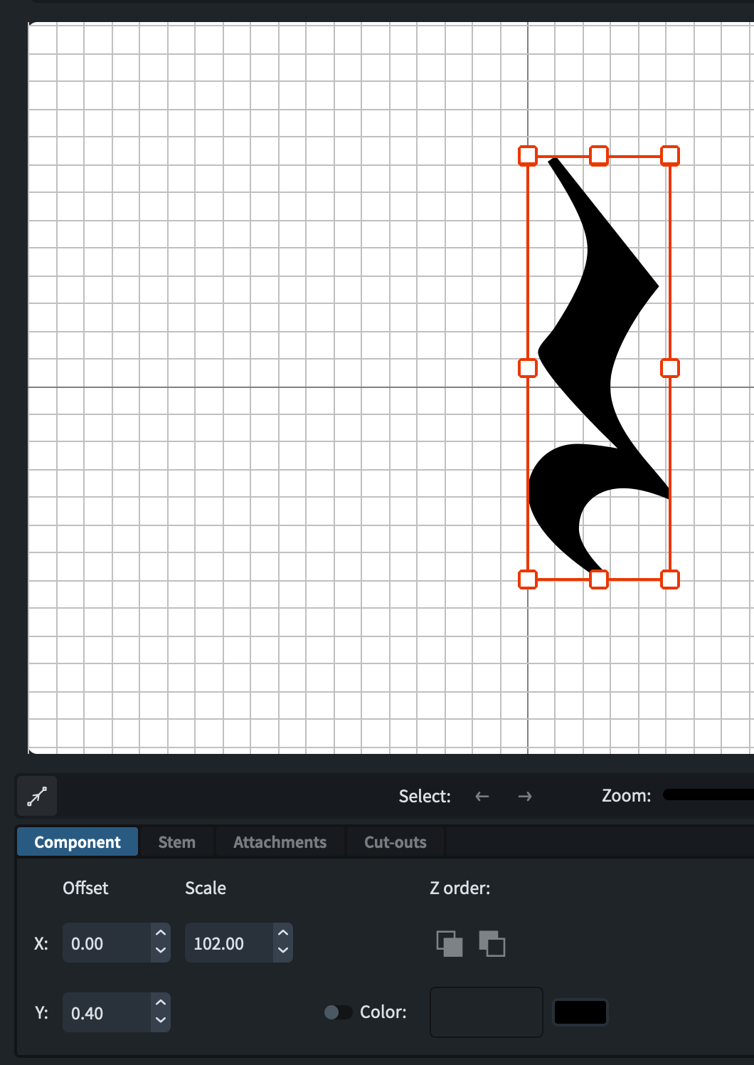
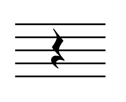
I don't like when that hits the line either and don't generally like it when the open counter there is too small. The top "tail" of #6 sometimes seems a bit wispy to me in context. If I make a slight change to the vertical positioning of #6 in Dorico using Music Symbols / Rests to open up that lower counter, do you like this better or worse?
- 6edit.png (95.35 KiB) Viewed 52705 times
- 6.png (16.54 KiB) Viewed 52706 times
Re: SMuFL Quarter Rest Design
Posted: 27 Jul 2025, 15:04
by benwiggy
Fred G. Unn wrote: ↑27 Jul 2025, 12:29 in some reprint I have (1700s?) it gives the sequence of durations explicitly showing the backwards eighth rest used as a quarter rest.
Novello's moveable type scores used a "backwards quaver" for crotchet rests into the early 20th century. Arrrgh!
Re: SMuFL Quarter Rest Design
Posted: 27 Jul 2025, 23:38
by OCTO
I don't know why I love this types of topics. A fetish?