Page 1 of 1
Modified Dorico Flags Comparison
Posted: 05 Sep 2025, 22:15
by Wescott
I don't like the flags in Bravura, Leland, or Maestro, and those are the only SMuFL fonts for flags I have, so I modified the Bravura flags for 8ths. I especially do not like Bravura's shortened flag for dotted notes, it's not even based on the un-shortened flag.
Let me know what you think. Bravura flags on top, mine are on bottom:
- Bravura.png (46.36 KiB) Viewed 363 times
Re: Modified Dorico Flags Comparison
Posted: 06 Sep 2025, 17:45
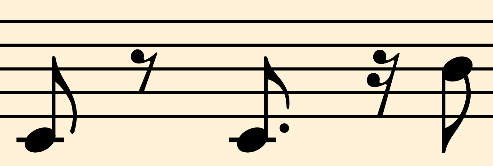
by John Ruggero
Dorico provides four different possibilities for dots and flagged notes:

- Dorico flags.png (25.27 KiB) Viewed 190 times
You have chosen no. 2, which I also think is undesirable. But while yours is perhaps better, I use no. 4. No problems.
Re: Modified Dorico Flags Comparison
Posted: 06 Sep 2025, 18:02
by Wescott
I know, but the option I prefer is just to shorten the flag. I don't want a collision, and the other two options take up more real estate, so shortening the flag works best for me.
Re: Modified Dorico Flags Comparison
Posted: 06 Sep 2025, 18:29
by benwiggy
If you have Dorico, you should also have Sebastian, which has different flags from Bravura.
TBH, I'm not wild about short flags, whatever they look like.

Re: Modified Dorico Flags Comparison
Posted: 06 Sep 2025, 20:13
by Wescott
Coincidentally I was just about to load up Sebastian this afternoon and check it out. Is there a project file using Sebastian I can download somewhere btw?