Page 1 of 3
[Dorico] Flat slurs
Posted: 03 Jun 2016, 15:54
by OCTO
It seems that Dorico will implement flat slurs.


- LFZhiHh.png (54.08 KiB) Viewed 18313 times
(picture provided by Daniel S)
Re: [Dorico] Flat slurs
Posted: 03 Jun 2016, 16:33
by John Ruggero
I saw that as well, OCTO. It is a beautiful "flat" slur, because it does not appear to be flat, whether or not a small part of it may actually be flat, which is really hard to say.
Re: [Dorico] Flat slurs
Posted: 21 Apr 2017, 09:39
by benwiggy
Here's my default in Finale:

- Screen Shot 7.png (21.18 KiB) Viewed 17782 times
The thickness will probably be cause for comment (it's 2pt). That works better with shorter slurs, which my music has more frequently, and I find it makes for a better contrast against ties. You also notice the tapering more.
Re: [Dorico] Flat slurs
Posted: 25 Apr 2017, 22:42
by John Ruggero
It isn't the thickness of the slur that struck me, but the size of the note heads!
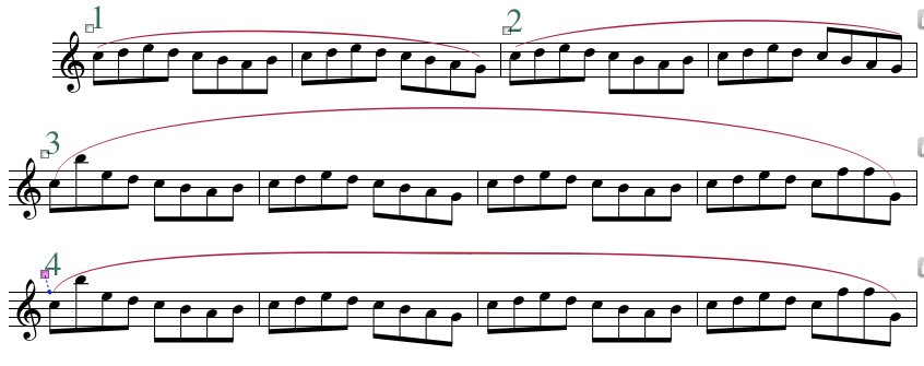
As you show, Finale does a very nice job with situations like the one in the example. Here is my take:
No. 1: I changed the direction of the stems at the end for the sake of better continuity and also to help the slur shape.
No. 2 is like the original.
But it is in situations like no. 3 that there seems to be no way to do this in Finale with a single slur. One must piece it together as in no. 4.

- Slurs.jpg (60.15 KiB) Viewed 17714 times
Re: [Dorico] Flat slurs
Posted: 26 Apr 2017, 11:46
by benwiggy
For 4, you can manually tweak the slur, thus.

- Screen Shot 10.png (29.64 KiB) Viewed 17699 times
I use a Slur Contour inset of 5% for all but Small Slurs.
"Piece it together"? Surely you don't mean making two "half-slurs" join each other?
The noteheads are just Engraver 24pt. My vocal scores tend to use a smallish staff size, and a bigger head works well.
Re: [Dorico] Flat slurs
Posted: 26 Apr 2017, 17:52
by OCTO
I totally agree with John here, in regards of slurs/beams and ..noteheads. I really don't think that the size of the notehead is more "visible" if they are used larger at small staff size, but the shape of the noteheads. What about Maestro at 25pt? Maestro has a flat area that has a greater friction thus, in my opinion, appears more bold and stable.
Back to the topic: benwiggy, in your above example I dislike the very Finale-typical slur ending which is extremely curved at the edges. Not exactly sure how to call these ending curves in English, I believe that the node farthest left should not go behind the slur's left tip-node. A setting in Sibelius can combine both "lift" and "stretch" slurs, which is unavailable automatically in Finale. Therefore I would both lift and stretch to get compensated:
Re: [Dorico] Flat slurs
Posted: 26 Apr 2017, 17:57
by OCTO
For the 4th example of John, I would use (in Finale) more lift than stretch:
Re: [Dorico] Flat slurs
Posted: 26 Apr 2017, 18:42
by John Ruggero
benwiggy wrote: ↑26 Apr 2017, 11:46 For 4, you can manually tweak the slur, thus.
I am not willing to put up with the backward thin curved ending that is produced by this sort of tweaking. (What OCTO was describing.) Also the leap at the end of the passage in my example is another factor that makes this a difficult slur. No fair to leave it out!
benwiggy wrote: ↑26 Apr 2017, 11:46 Piece it together"? Surely you don't mean making two "half-slurs" join each other?
I do indeed. Actually no. 4 is three slurs, two meet in the middle and a third short one overlaid to thicken the middle. It can be done much more nicely, but this was just a quick example.
Allowing the ends of the slurs to float above the notes as in OCTO's nice examples, works in a practical sense, but I was showing what results when one insists on bringing the end of the slur down to the note heads. In this case it is really impossible to get an acceptable result. My point being that while some of us consider Finale's slurs to be the most beautiful ever used in music engraving, one is limited in what one can do in terms of overall shape. But, I would go with Finale over Dorico until Dorico can produce the same beautiful slurs even if a few exceptional slurs are difficult to create. Best would be if MM gets it 's slur act together.
Re: [Dorico] Flat slurs
Posted: 26 Apr 2017, 22:54
by Schonbergian
Re:notehead size - I agree with Ben's notehead size but the staff lines need to be much thicker to compensate, otherwise it's imbalanced. I'm also not a fan of the shape of the Engraver noteheads.
Re:slurs - this is a perfect example of when insisting on the slurs meeting the noteheads won't result in an optimal solution. As long as the slur is close and follows the contour of the musical phrase, it'll look fine. Ben's latest example 4 minus the weird extreme curves on either end looks the best to my eyes.
Re: [Dorico] Flat slurs
Posted: 27 Apr 2017, 00:07
by John Ruggero
Schonbergian wrote: ↑26 Apr 2017, 22:54
this is a perfect example of when insisting on the slurs meeting the noteheads won't result in an optimal solution.
For me, the optimal solution is always to bring the ends of the slur down to the note heads when possible. Not doing so is second best. Unfortunately Finale cannot do this in this case without a workaround. But that is all beside the point I was making, which is that Finale should be able to do anything that an engraver wants to do; and in the case of some slurs, it can't.
I also don't care for the shape of these note heads and much prefer Maestro.
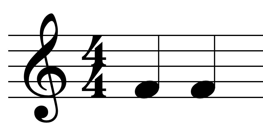
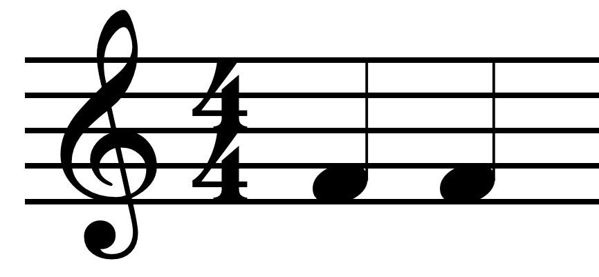
As far as note head size, it has to do with proportion. In this case, the note heads actually overflow the staff lines. To me, that means they are too big for their staff, and I don't think that increasing the thickness of the staff lines will improve the situation. I did an experiment with a Finale default file. The 24 pt Maestro and Engraver note heads stayed within the spaces even when the staff lines were reduced to .04 space, which is about half of the Finale default setting at .075 space, which itself is quite thin. I then tested 26 pt Engraver notes whose overflow seemed to match the example (see example 1) and had to increase the staff lines to .14 space, almost double the Finale Default, before the note heads stopped overflowing the staff lines. The resulting staff lines are thicker than many would find acceptable. (Example 2 below.)

- Staff lines A.jpg (28.03 KiB) Viewed 17664 times

- Staff lines.jpg (29.78 KiB) Viewed 17667 times
So I think that it is the the staff itself that is too small for the note head size used.

 (picture provided by Daniel S)