Page 1 of 1
Real Book Style
Posted: 16 Dec 2017, 04:21
by odod
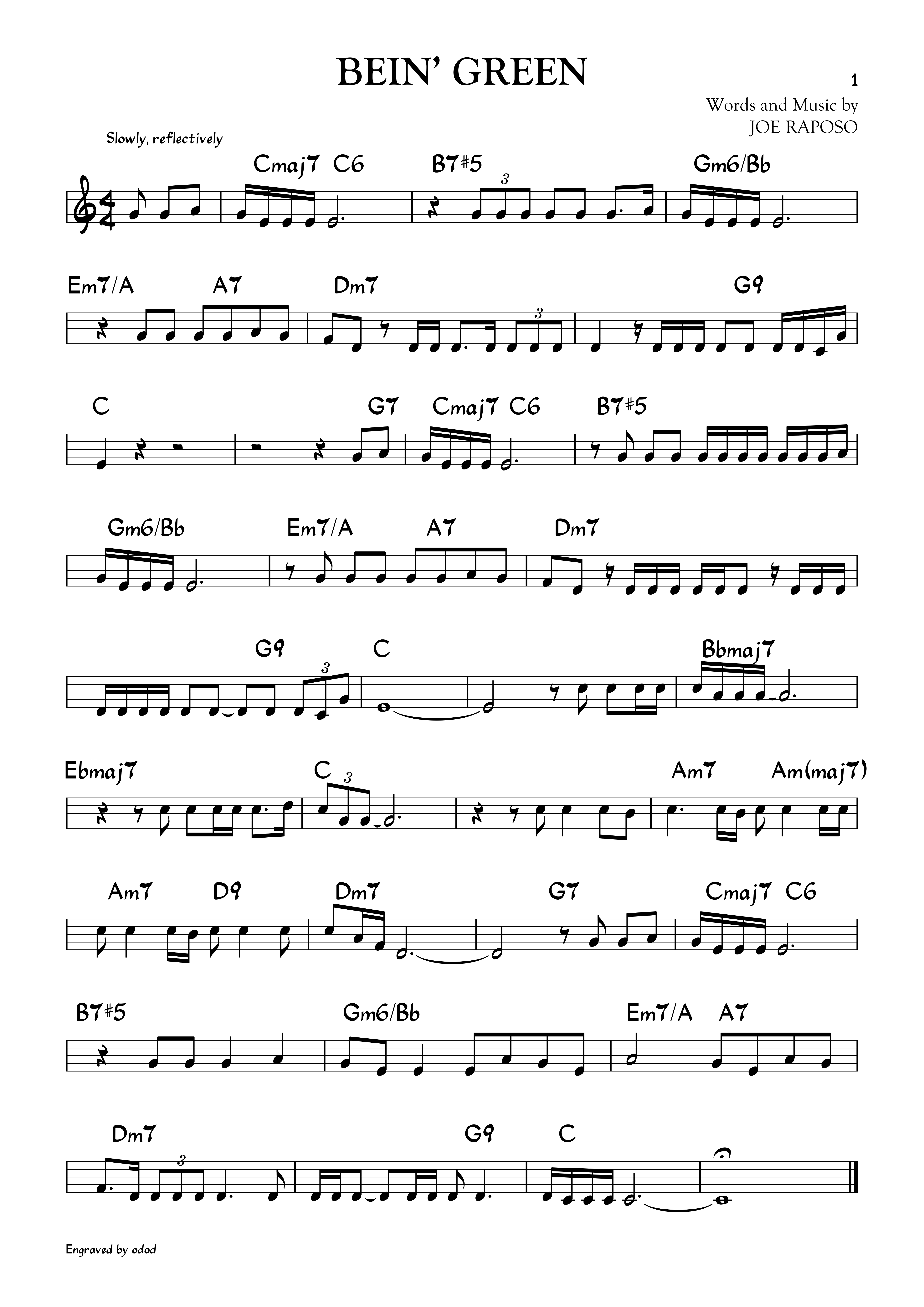
I came across with these two styles, which one do you prefer ?
home made font based on Sher Music Real Book

- Sher.png (794.34 KiB) Viewed 13254 times

- Hand.png (799.59 KiB) Viewed 13254 times
any advise on the style itself ?
regards
Re: Real Book Style
Posted: 16 Dec 2017, 15:08
by Schonbergian
Notwithstanding some minor engraving issues, I much prefer the balance of the second. The first is too high-contrast and light, especially when compared to the text font, and I think the time signature being larger than the staff only looks appropriate when hand-written.
Re: Real Book Style
Posted: 16 Dec 2017, 16:58
by John Ruggero
I agree.
Re: Real Book Style
Posted: 30 Mar 2018, 17:39
by laurencepayne
Both irritatingly 'quirky' I'm afraid. The '7' characters in the chord names are particularly annoying. And many chord symbols are aligned too far to the right.
Sorry.