Page 1 of 1
Two November 2 issues
Posted: 10 Dec 2022, 18:30
by Harpsichordmaker
I have two issues with November 2. I'll put here just one as it seems a design issue (but may be a software issue, I don't know). The other one is software-related and I'll write in another forum.
So, due to the somewhat large tail of the 8th, the dot of a dotted 8th crashes against the tail provided that: 1. the note is on a line of the staff; 2. the stem is up.
What could I do? I assume I
should do something. I'd love to use that font as this is for a publication. Please look at the picture.
Is it a font issue? is it a software issue?
I am using Sibelius Ultimate on Mac. I am aware November 2 has issues with Sibelius on WIndows (due to a Sibelius bug, so the November 2 documentation says), but on mac it should be fine.
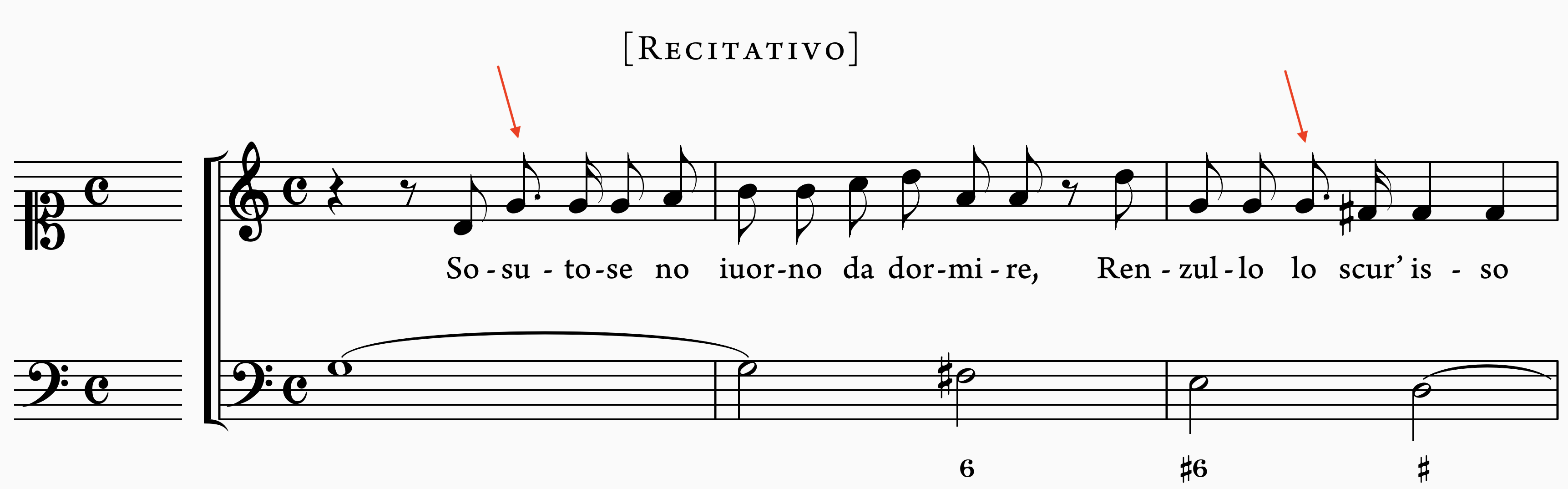
- Screenshot 2022-12-10 alle 19.16.26.png (199.54 KiB) Viewed 14963 times
Re: Two November 2 issues
Posted: 13 Dec 2022, 09:20
by OCTO
Is it possible to move the dot as a setting in Sib? Try 1sp from the notehead, or 0.5sp from the notehead.
Re: Two November 2 issues
Posted: 13 Dec 2022, 12:58
by Harpsichordmaker
Yes in Sibelius it's possible to set the dot's distance from the notehead, both on a global and individual basis. I was just wondering why this issue is not handled automatically.
As I don't like the dot to be too far from the notehead, I'd get a double approach: 1. lightly move the dot on the right; 2. lenghten the stem so the curve of the tail doesn't hit the dot. Here is it the result: what do you think?
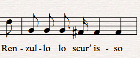
- Immagine 2022-12-13 135418.png (20.64 KiB) Viewed 14881 times
Re: Two November 2 issues
Posted: 13 Dec 2022, 14:37
by MichelRE
in your images it gives me the distinct impression that the dot is too high up in the space, too close to the upper staff line.
could this be a minor defect in the font?
Re: Two November 2 issues
Posted: 14 Dec 2022, 15:38
by Harpsichordmaker
MichelRE wrote: ↑13 Dec 2022, 14:37
in your images it gives me the distinct impression that the dot is too high up in the space, too close to the upper staff line.
could this be a minor defect in the font?
What a sharp eye, Michael!
I never noticed this but it's just as you say: the augmentation dots are too high in the space.
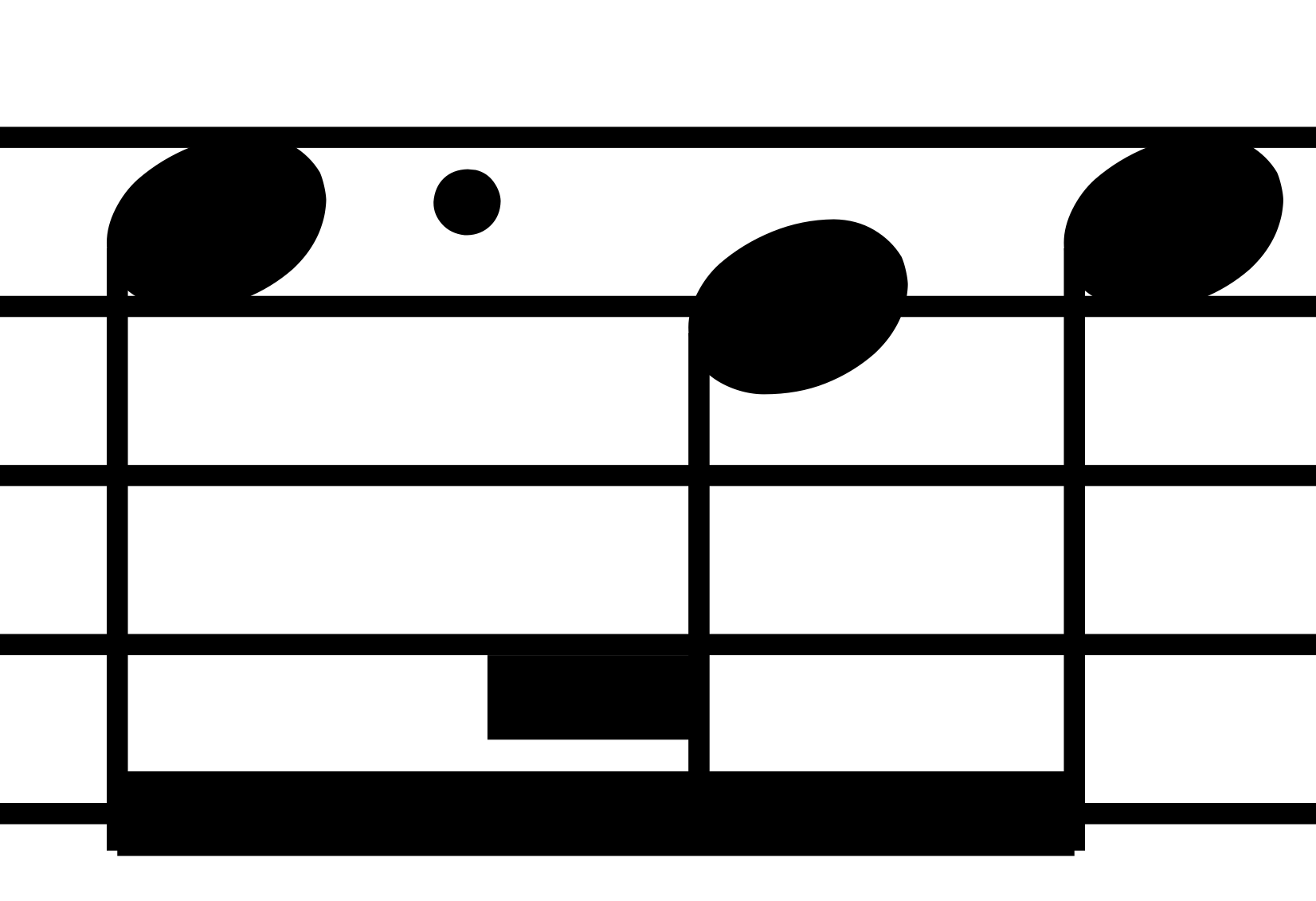
- Screenshot 2022-12-14 alle 16.33.12.png (65.13 KiB) Viewed 14827 times
- Screenshot 2022-12-14 alle 16.36.05.png (26.96 KiB) Viewed 14827 times
Maybe this could be enough to cause the crash with the tails.
Re: Two November 2 issues
Posted: 14 Dec 2022, 16:21
by MichelRE
I think there's a bit of "illusion" that's causing that clash.
the fact the dot is too close to the line, the tail ending very near the dot, it tends to force the eye to close up and darken that space.
I honestly believe that if the dot were lower, there'd be a tiny bit more white space, and most likely JUST enough to remove this illusory effect and avoid it looking like a clash.
Re: Two November 2 issues
Posted: 14 Dec 2022, 17:13
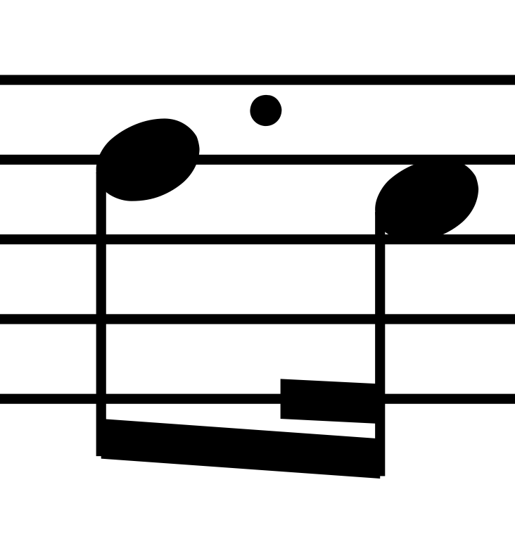
by tisimst
Actually, the flag crosses all the way through the dot where it is currently positioned. Look very close.
FWIW, you can adjust the symbol position in the symbol editor, but that’s not really the ideal solution.
Re: Two November 2 issues
Posted: 21 Dec 2022, 13:12
by NorFonts
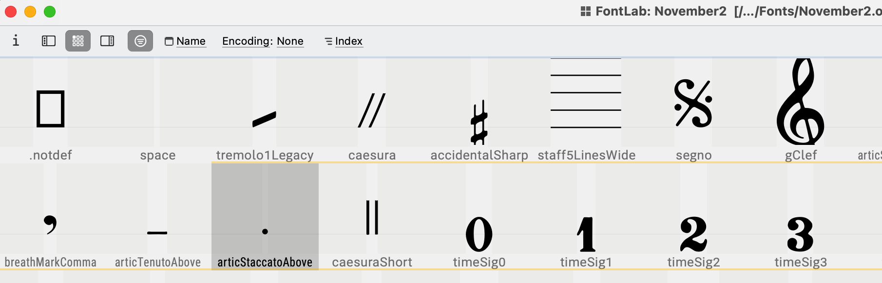
Somehow the dot glyph is not centered:
It should be centered in the font itself in order to be centered in the space.
Re: Two November 2 issues
Posted: 22 Dec 2022, 22:05
by Harpsichordmaker
NorFonts wrote: ↑21 Dec 2022, 13:12
Somehow the dot glyph is not centered:
It should be centered in the font itself in order to be centered in the space.
Hi NorFonts, that’s what I was thinking too. Then I noticed that if I only changed the music font without loading the whole November house style (which the font installer installs as well), then the dot was centered. After a bit of study I found it was an error in the house style file which has a wrong height positioning of the dot symbol.
Adjusted that in the Symbols properties window, saved the house style and everything is ok. Maybe I should tell the author so he can fix the house style value for the dot symbol.
Thanks all.
Re: Two November 2 issues
Posted: 24 Dec 2022, 11:56
by NorFonts
Oh! I might be wrong, actually Sibelius should use the augmentation dot found within the font itself, see below: (which seems to be centered)
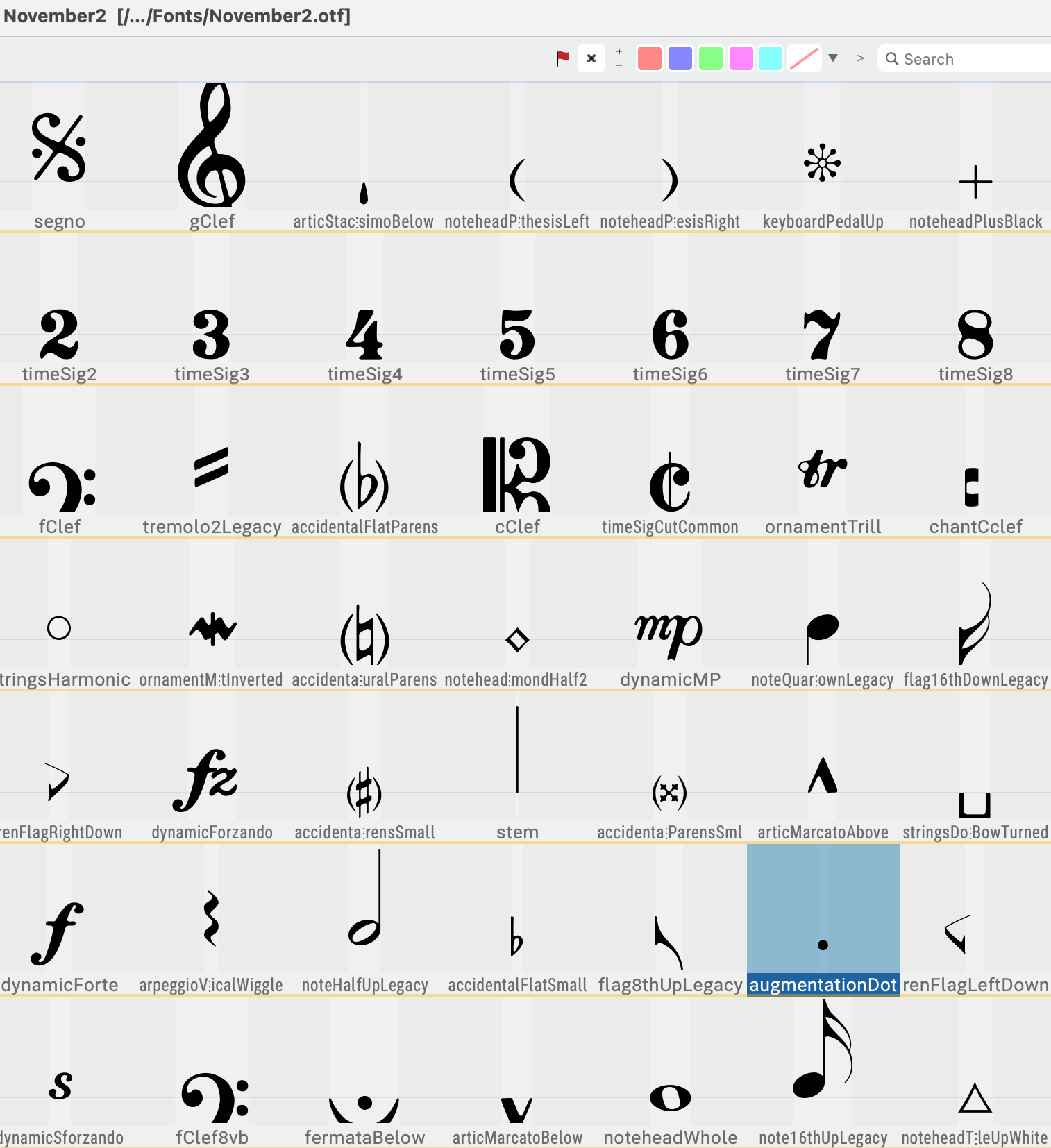
- CleanShot 2022-12-24 at 12.52.28@2x.png (340.24 KiB) Viewed 14527 times
While the screenshot I posted here:
NorFonts wrote: ↑21 Dec 2022, 13:12
Somehow the dot glyph is not centered:
It should be centered in the font itself in order to be centered in the space.
is actually for the Staccato above, and that's why it looks not centered, please select "augmentation dot" in the Sibelius symbols to get the dot entered.
- CleanShot 2022-12-24 at 12.52.12@2x.png (126.87 KiB) Viewed 14527 times