Hi
DePaule,
If you're still interested, I can offer a few (good-natured!) suggestions:
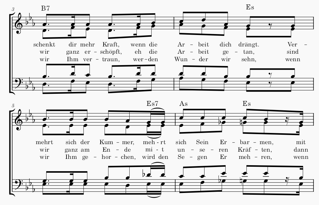
• Consider beaming over your rests, as I think it's easier for performers to count notes as beamed units rather than singly. In 2- and 4-based time signatures, you won't want to beam more than two beats; but in 3-based sigs like 6/8 (here), beaming three beats is fine; it's all about legibility.
• When a one-syllable lyric is held over two or more notes, it's fine (and often clearer) to hyphenate it.
• Serif text (lyrics, chord symbols) is usually easier to read than sans-serif, as it has a bit more detail for the brain to pick up on.
BTW, what notation app are you using? The notes seem unusually small. You may find larger noteheads easier to read.
Here's an example, using these ideas, that I just whipped up in the free MuseScore notation software (
www.musescore.org), which has really come into its own with its latest version. (I've switched to it from Sibelius.) Once you learn the basics, it's quite fast; this example took about 10 minutes (including the special German characters—LOL).
It uses their new Leland music font, which I really like for its legibility and esthetics. It has a fun history, too:
How I Designed a Free Music Font for 5 Million Musicians (YouTube)
Finally, maybe it's just me—but when simultaneous rests in two voices of vocal music are a certain distance apart, I like to give each voice a rest (as in T/B in the 2nd bar here), rather than requiring both parts' eyes to jump to a single rest between them.
Hope this helps. (It helped me feel useful, at least

) Cheers, A.
- music_example.png (40.74 KiB) Viewed 5005 times
 ) Cheers, A.