I think you need to design it...
Use FontForge. And let us show what you can!
Freelance Composer. Self-Publisher. Finale 27.5 • Sibelius 2024.3• MuseScore 4+ • Logic Pro X+ • Ableton Live 11+ • Digital Performer 11 /// MacOS Monterey (secondary in use systems: Fedora 35, Windows 10)
You'll have to use a different font for that character. However, 'matching' a flat symbol to am industrial Grotesque (in the nicest possible sense!) font like Impact is not going to be easy.
Very few text fonts have (decent) accidentals in the normal Unicode positions (U + 266D to F): you'll have to use one from a music font.
Take small cap "b" from the font and try to tweak it.
Freelance Composer. Self-Publisher. Finale 27.5 • Sibelius 2024.3• MuseScore 4+ • Logic Pro X+ • Ableton Live 11+ • Digital Performer 11 /// MacOS Monterey (secondary in use systems: Fedora 35, Windows 10)
Thanks everyone! To a man on a galloping horse, the Broadway Copyist flat symbol actually looks not half bad when placed in close proximity to Impact font. I am thinking I could possibly get away with it.
Screen Shot 2023-09-01 at 4.03.27 pm.png (11.3 KiB) Viewed 38436 times
I've downloaded FontForge and I will attempt to tweak the flat symbol.
jrethorst wrote: ↑31 Aug 2023, 20:01
Arial, Courier New, Lucida Sans, MS Reference Sans Serif and Times New Roman are common fonts that include musical symbols
Note my use of the word "decent". Here's Arial's Sharp:
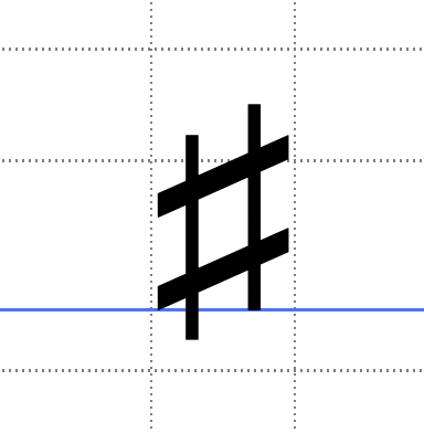
Screenshot 3.png (55.03 KiB) Viewed 38431 times
It doesn't have a flat, nor natural. It does have two other music characters: a single quaver, and a pair of beamed quavers.
Courier Std (not New) contains the two quaver chars only.
MS Reference does have the three accidentals, but they are awful.
Times has the same characters as Arial, and they are similarly awful.