OCTO wrote:Knut wrote:As you can read from my comments earlier in the thread, I agree that the weight (or BW balance, if you will) of the courtesy clefs is one of the two main reasons to utilize separate dedicated glyphs for this purpose.
Exactly so, you have provided a beautiful solution in another thread.
I really appreciate that, OCTO. However, my current g clef has a slightly different design, which may need some different tweaks.
John Ruggero wrote:I have only done a little work on a small G clef and don't yet have an F clef, so I used the default Finale 75% F clef. My small G clef = large G clef with a 80% horizontal and 83% vertical reduction. Maybe it should be taller; more like 85%.
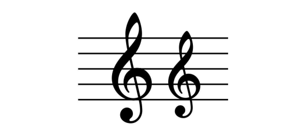
I think there are a couple of main things to consider in the design of the reduced g clef shape:
1. The spiral needs to be large enough to prevent the upper arch from being too close to the g line, creating an obstructive 'wedge'.
2. The same thing goes for the upper part of the eye, which needs to go clear of the upper staff line by a certain margin.
Depending on the shape your working with, it might need some additional tweaks after the initial scaling. I prefer the spiral to be completely circular, so an overall disproportional scaling doesn't work for me. In my case, this means that the shape will have to be slightly wider than what I would have liked, but it's better this way, in my opinion.
The eye is more flexible in terms of disproportional tweaks. For a clef like mine, with such a narrow eye, I think it looks better when it's slightly widened to compensate for the reduction in size.
With all this in mind, here's a side by side comparison with the regular sized clef:
- Skjermbilde 2016-04-10 kl. 14.04.22.png (48.14 KiB) Viewed 9217 times
