Similarly I used before Modern No20, but the italic is missing.
I love Old Standard too, but I have difficulty with the "f" italic.
I find that the main issue with all these fonts is discrepancy between thin lines and fat lines, somehow the thin lines are too thin, thus disappearing from page. Unfortunately there is no tool available to do that properly (=embolden thin lines only), and so anyone who wish to tweak a font needs to do it manually.
Here are three versions, the top one is my Muzitex v3, that really stands out, without trouble for reading, I think I still wait for a proper font to replace it fully:
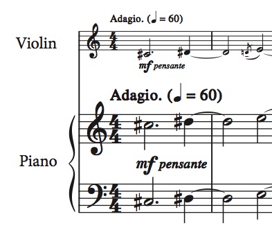
- Screen Shot 2021-01-09 at 23.55.05.jpg (41.28 KiB) Viewed 15992 times
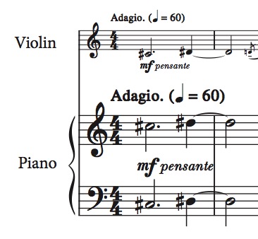
- Screen Shot 2021-01-09 at 23.55.14.jpg (40.17 KiB) Viewed 15992 times
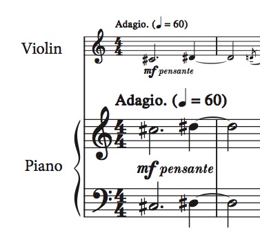
- Screen Shot 2021-01-09 at 23.56.43.jpg (39.66 KiB) Viewed 15992 times
