You are right, and it's a bit of a trick to make the cautionary treble clef look like it's in the right place, but still be aesthetically pleasing to the eye, when technically it should have the same crosshair look around the second staff line.
And I apologize, I'm not saying that I or anyone should like the different looking cautionary clefs. I was only saying that they are a thing and unsurprisingly so when punches were hand-made or the symbols were hand-written. Certainly, if the smaller clef resembles the full size one, then great! If the software can take it to the next level of making them optically correct, then that makes me happy. Here's an analogous example in text:
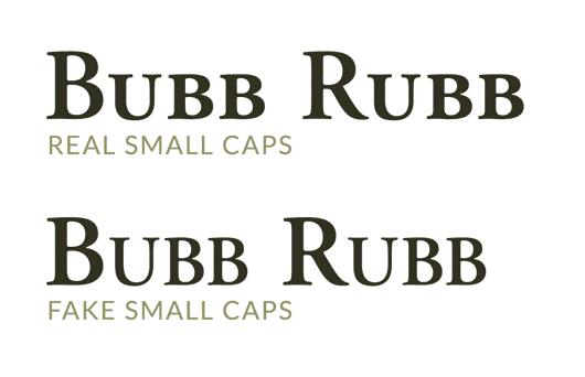
If you look at the top line, all the small-cap letters have a similar "weight" to the full-cap letters, while the lower ones don't because they were just scaled down from the full-cap size and they end up looking thinner and anemic. This is one reason LilyPond does so well is that is has optically correct small symbols that are visually cohesive with full-scale ones. It's also why I'm a fan of designing cautionary clefs at their expected size.
Flat slurs
Re: Flat slurs
Music Typeface Designer & Engraver - LilyPond | Sibelius | Finale | MuseScore | Dorico | SMuFL | Inkscape | FontForge
-
- Posts: 2677
- Joined: 05 Oct 2015, 14:25
- Location: Raleigh, NC USA
Re: Flat slurs
tisimst, I have a feeling that you have a much higher standard for saying that one glyph "resembles" another than I do! (Which is to be expected.) 

M1 Mac mini (OS 12.4), Dorico 5, Finale 25.5, GPO 4, Affinity Publisher 2, SmartScore 64 Pro, JW Plug-ins, TG Tools, Keyboard maestro
Re: Flat slurs
Isn't that what the gClefSmall glyph in SMuFL is supposed to be? An optically sized clef for use at small sizes. Which would then kind of make sense that as the size approaches full size, the symbols reverts to the 'normal' size one.
Re: Flat slurs
Can’t say whether it’s “supposed” to be for that. Given that there are many other “small” music symbols in that range, I didn’t think it was intended for that, especially when there’s a dedicated set cautionary clefs. In any case, what you’ve suggested is exactly what Dorico does. The glyph gClefSmall is full sized in the font as are all the other “small” glyphs because they are expected to be scaled down on a smaller size staff relative to the normal symbols so the end up with an appropriate weight at small size. I never expected those to be used for cautionary purposes.
Music Typeface Designer & Engraver - LilyPond | Sibelius | Finale | MuseScore | Dorico | SMuFL | Inkscape | FontForge
- Fred G. Unn
- Posts: 491
- Joined: 05 Oct 2015, 13:24
- Location: NYCish
Re: Flat slurs
What about the current push for "variable" fonts? Do you see any possibility of a variable SMufL font, or is that way too much effort to develop and too complicated for Dorico to support? I still have 20 year old Finale files that open incorrectly (have to swap with Data Check/Font Utilities) because I was way into Adobe's Multiple Master fonts back then and had lots of optically sized instances installed. A variable version of Bravura could have the clefs automatically optically modified to have the optimum appearance at whatever size they will be rendered. Would something like that be possible with enough time and resources? Or too unlikely to be of value to enough people for anyone to bother pursuing?
- JoshNichols
- Posts: 52
- Joined: 09 Feb 2021, 02:57
- Location: USA
- Contact:
Re: Flat slurs
This is exactly what Lilypond does: There's optically sized versions of emmentaler in various staff sizes. However, LilyPond doesn't handle fonts even remotely as elegant as SMuFL does.Fred G. Unn wrote: ↑22 Feb 2021, 21:01What about the current push for "variable" fonts? Do you see any possibility of a variable SMufL font, or is that way too much effort to develop and too complicated for Dorico to support? I still have 20 year old Finale files that open incorrectly (have to swap with Data Check/Font Utilities) because I was way into Adobe's Multiple Master fonts back then and had lots of optically sized instances installed. A variable version of Bravura could have the clefs automatically optically modified to have the optimum appearance at whatever size they will be rendered. Would something like that be possible with enough time and resources? Or too unlikely to be of value to enough people for anyone to bother pursuing?
WINDOWS 11 · DORICO PRO 4 · LILYPOND 2.20.X · CUBASE 11 · AFFINITY STUDIO (DESIGNER, PHOTO, PUBLISHER) · DAVINCI RESOLVE
“Complexity is layered simplicity.” – James Wiznerowicz
Re: Flat slurs
Interestingly, in the examples of engraved clef changes, the clefs don't sit on the G line, but are much lower: presumably this is done to stop the ball hitting the staff line, and to get the loop at the top sitting nicely in a space.