Dan, you are endeavoring to do something even more challenging than most attempt. When staying within the world of music symbols, you can take a lot of liberties when it comes to creating a cohesive design because most symbols don't have a lot of similarities. However, when trying to match up to a text font, which has A LOT of similarities, you're going to have to synthesize music symbols a bit differently.
I recommend pulling curves/features from the text glyphs themselves with minor modifications as a starting point paying careful attention to thick & thin. Since text on a music score tends to be sized such that the x-height is roughly a single staff space, this makes for a pretty small thick/thin ratio to base music glyphs off of. Thus, I'd use the BOLD version of Trinite as more of a design guide for the treble clef since it also has a higher contrast between thick & thin, probably for other music symbols, too.
Here are some stylistic examples I had a small hand in, but mostly designed by a friend of mine, Giovanni Murolo. One sample is synthesized to work well with Bodoni, a high contrast serif font with a lot of finesse, and the other with Akzidenz Grotesk, a low contrast sans serif font that uses simple, blocky shapes. He did a great job, but I know it was quite the challenge for him. He borrowed features quite heavily from glyphs in the text font and I think they turned out great.
I hope you continue working on this! You're off to a fantastic start and hopefully the samples below give you some inspiration.
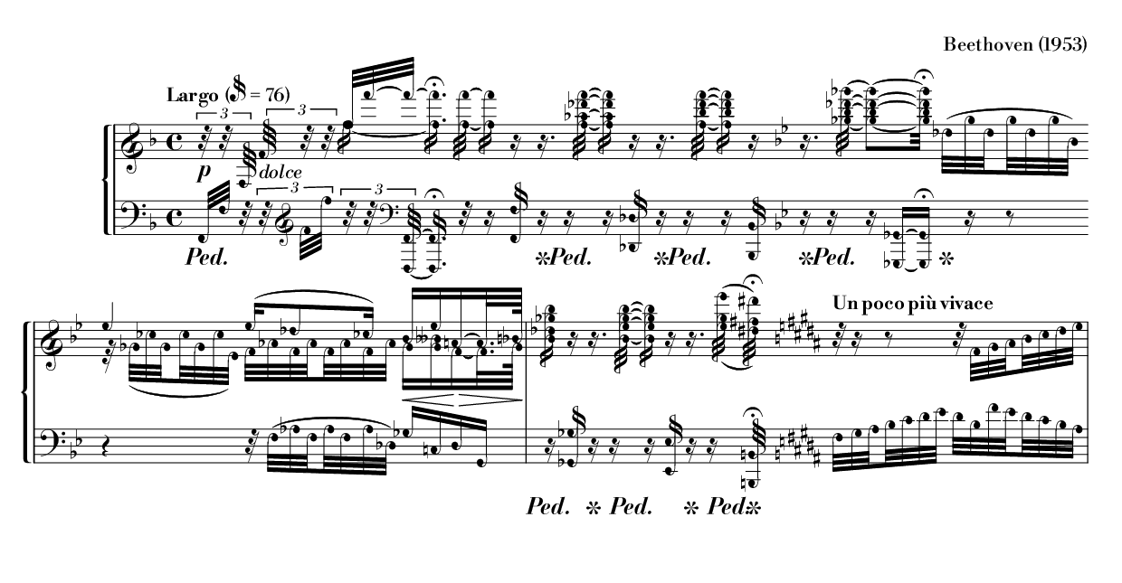
- MusicBodoni-1.0-1953-beethoven.png (80.14 KiB) Viewed 11839 times
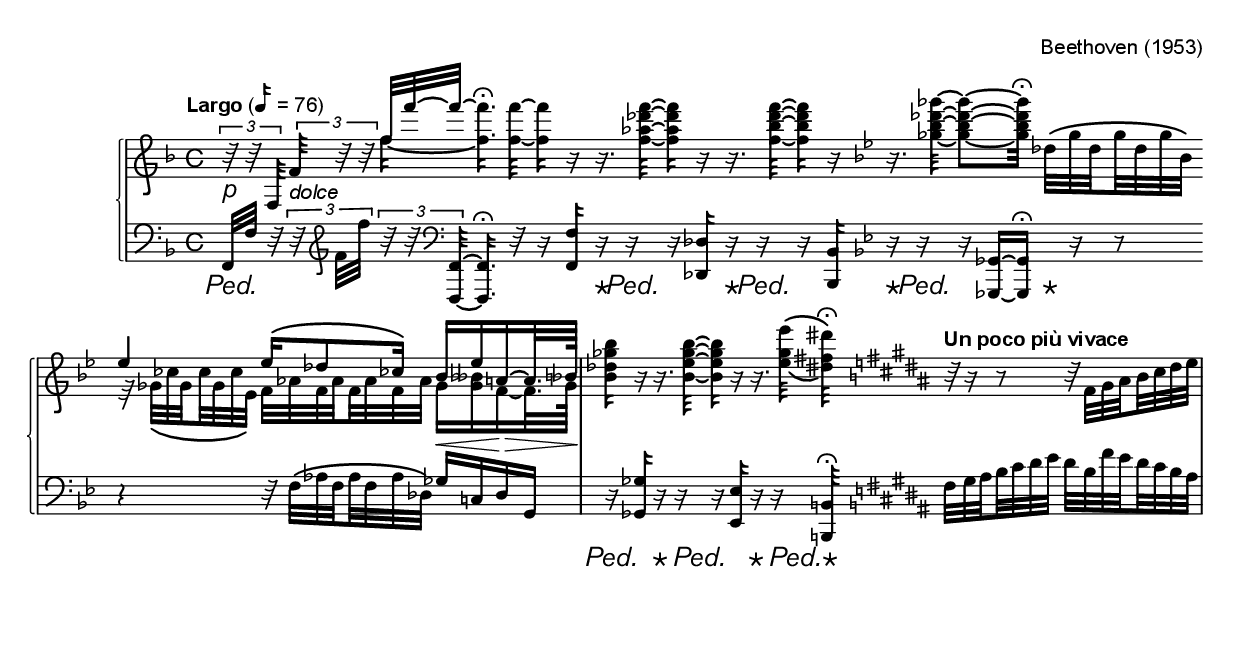
- MusicalAkzidenz-1.0-1953-beethoven.png (70.9 KiB) Viewed 11839 times


