Have your scores reviewed by other users. Comment on old and new published scores and on publishers.
-
benwiggy
- Posts: 996
- Joined: 11 Apr 2016, 19:42
Post
by benwiggy »
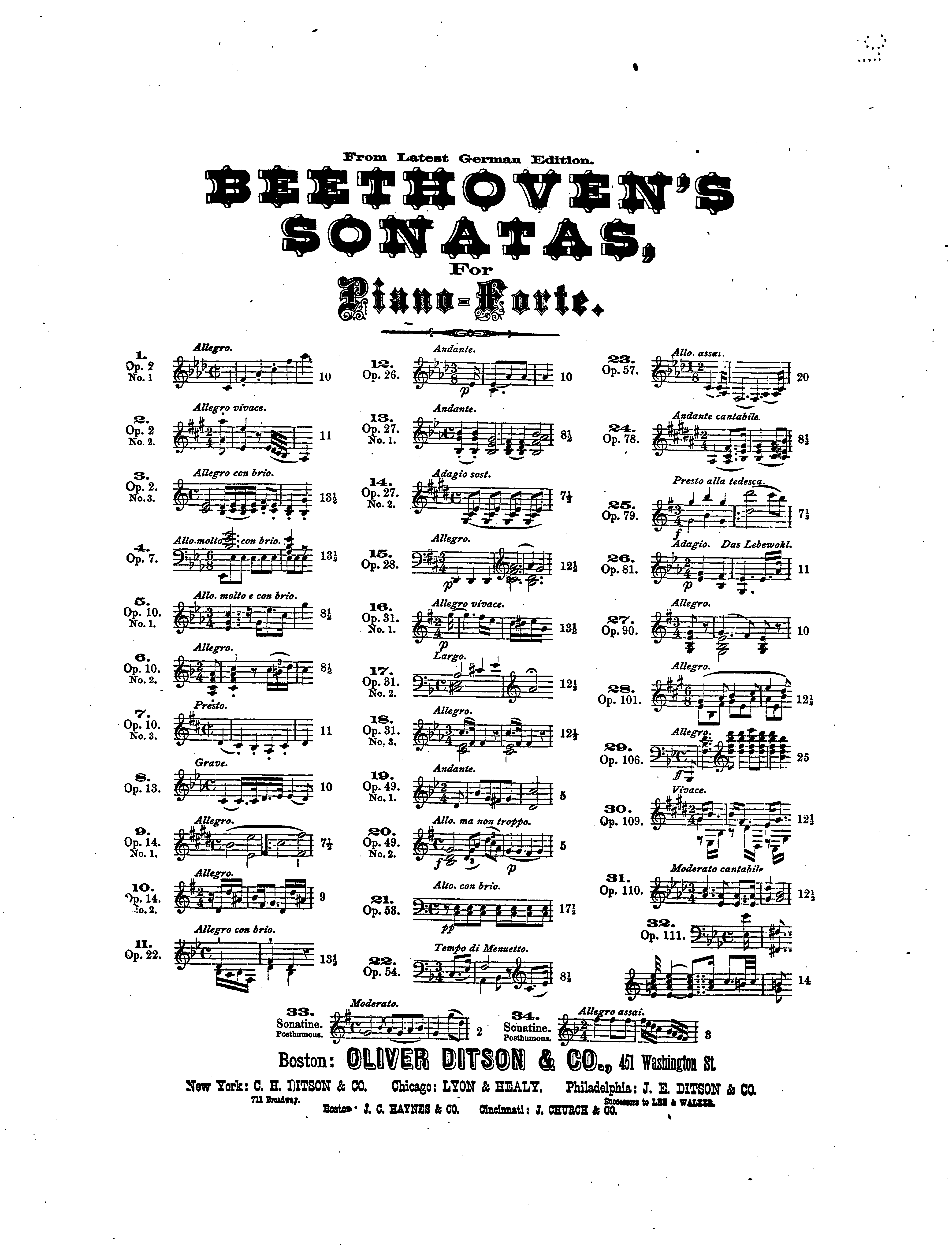
This score's frontispiece is typical of fin-de-siècle type design, where "more is more", as far as type styles is concerned.
A far cry from the usual design maxim of keeping type styles to a minimum (and 'don't underline').
- 177752875_1805741676272025_7089098601721355385_n.jpg (83.99 KiB) Viewed 7402 times
-
JoshNichols
- Posts: 53
- Joined: 09 Feb 2021, 02:57
- Location: USA
-
Contact:
Post
by JoshNichols »
Reminds me of this, though I reconciled this by "playing" with Minion to achieve the effect, without the fuss of possibly several different fonts:
- Lyon James Book 1_Page_01.png (416.18 KiB) Viewed 7368 times
My version:
- exercises in figured bass cover design.png (206.36 KiB) Viewed 7368 times
WINDOWS 11 · DORICO PRO 6 · LILYPOND 2.24.X · CUBASE 11 · AFFINITY STUDIO (DESIGNER, PHOTO, PUBLISHER) · DAVINCI RESOLVE
“Complexity is layered simplicity.” – James Wiznerowicz
-
John Ruggero
- Posts: 2808
- Joined: 05 Oct 2015, 14:25
- Location: Raleigh, NC USA
Post
by John Ruggero »
I prefer yours, Josh. Very nice. Here are couple of pages of interest. I stopped counting fonts when I got to 10:
- Beethoven op 10 no 2 Lebert, Faisst, Bulow 1.png (173.85 KiB) Viewed 7099 times
- Beethoven op 10 no 2 Lebert, Faisst, Bulow 2.png (213.99 KiB) Viewed 7099 times
M1 Mac mini (OS 12.4), Dorico 6, Finale 25.5, GPO 4, Affinity Publisher 2, SmartScore 64 Pro, JW Plug-ins, TG Tools, Keyboard maestro
-
JoshNichols
- Posts: 53
- Joined: 09 Feb 2021, 02:57
- Location: USA
-
Contact:
Post
by JoshNichols »
Oh my WORD. That looks horrendous. It feels aesthetically hairy.
WINDOWS 11 · DORICO PRO 6 · LILYPOND 2.24.X · CUBASE 11 · AFFINITY STUDIO (DESIGNER, PHOTO, PUBLISHER) · DAVINCI RESOLVE
“Complexity is layered simplicity.” – James Wiznerowicz