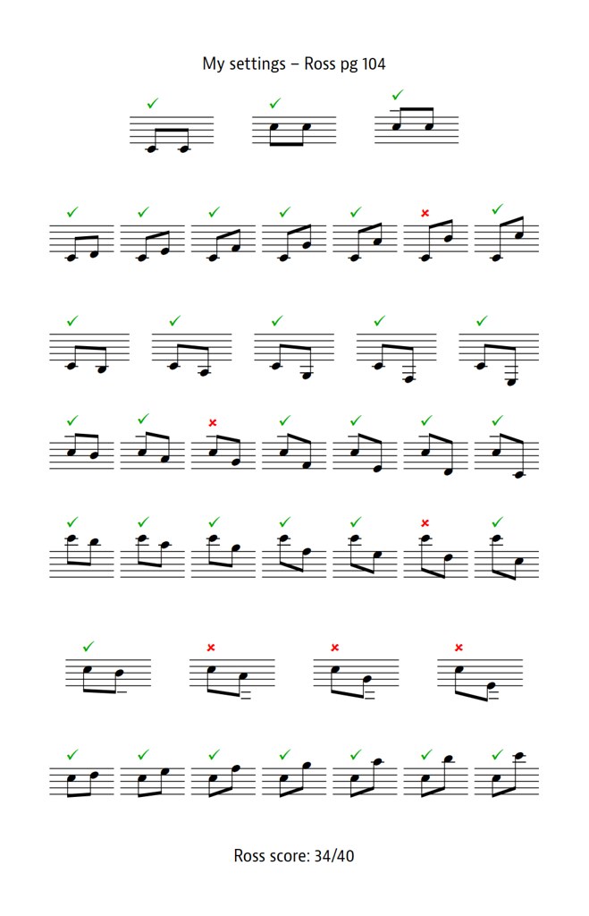
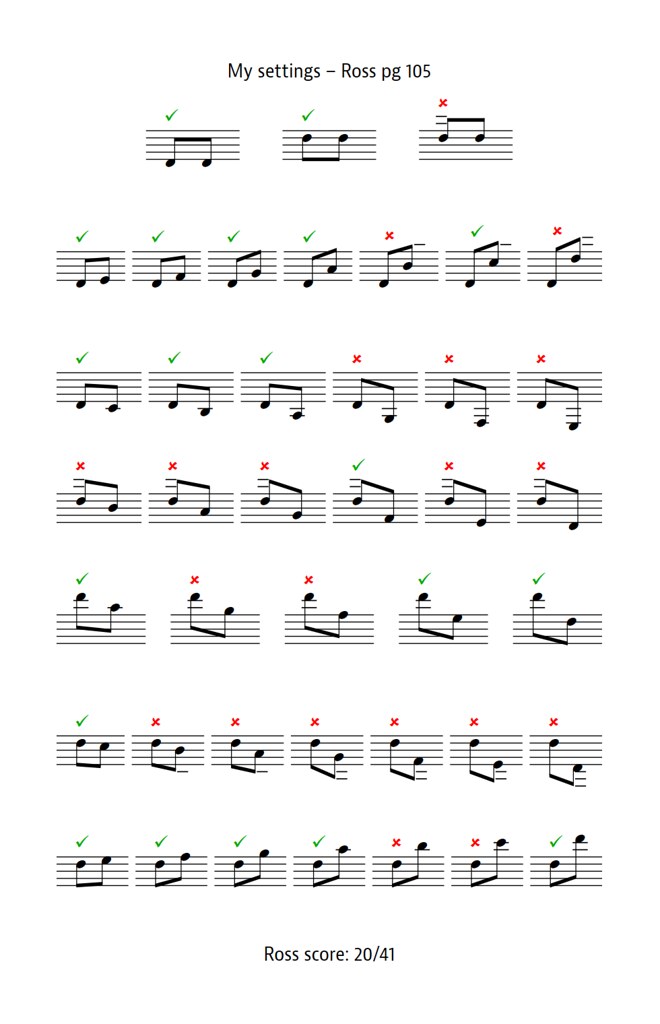
What an interesting exercise! I focused mainly on the slurs and beams in the following comments. As you may be suggesting, they do have a strong impact on the overall appearance of engraved music.
1. To me, the most glaring Dorico deficiency are the slurs, which have a strange contour with a long flat middle and the ends suddenly dipping down toward the noteheads. And the belly of the slur is too thin, so the slur doesn't catch the eye. Many have pointed this out since Dorico 1. However, with some changes to the settings, as proposed by Fred G. Unn in a Dorico thread, they can be much better. Yet the
ties have a beautiful contour and fullness in Dorico! So strange.
2. And as far as positioning, the Dorico slurs sometimes hug and get lost in the staff lines. Compare the Henle. m . 12, 24
3. There are the kind of deficiencies in the Henle slurs that one sometimes sees in hand engraved music. m. 7 was a real goof on the part of the engraver, caused by the finger number. It should have been corrected. The slurs in the portato indications in m. 12, 14 in the Henle look OK to me, but I usually flatten a slur in a portato indication more than other slurs to make the symbol appear unified.
3. The Dorico font for the expressions is a little too thin for my taste. But one sees this with some publishers.
4. Both follow the rule to place the beams on top of the staff lines, but, at times, Henle allows them to follow the contour of the notes more musically, even when this creates bad angles with the staff lines. The Dorico just follows the rule, which gives a cold, machine-like appearance. ms. 3, 6. 7 etc.
5. The two staves of each grand staff are too far apart from each other in the Dorico. The Henle exemplifies something that I have long believed: the two staves of a grand staff should appear to have been
forced apart by what is going on between the staves. That is, there should be minimal breathing room. This keeps the two staves more in contact with each other in a way which makes for better reading. It also makes it possible to put more space between the systems and get more systems on the page when necessary. Note that Henle even shortens the stems of beamed groups to keep the systems close, as in m. 2.
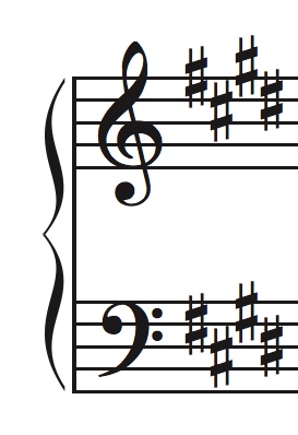
6. To me, the Dorico piano braces are thick and ugly. The Henle braces, with their nice balance of thick and thin, are much better. I like and use Wess' brace, which is even better:
- Wess brace.jpeg (30.96 KiB) Viewed 366612 times
M1 Mac mini (OS 12.4), Dorico 6, Finale 25.5, GPO 4, Affinity Publisher 2, SmartScore 64 Pro, JW Plug-ins, TG Tools, Keyboard maestro