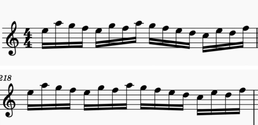
Since Benwiggy first posted the Dorico slurs and beams thread last month, I've probably changed my beaming defaults about 100 times, LOL! For reference, here's Dorico 3.5's factory settings:
... and my own current settings:
The tiny wedges in my settings look fairly poor here. I'm not really on board with the "just make everything a quarter slant" like the new Henle editions and MS4 either as it doesn't really follow the direction of the line and seems a bit sterile. Just wondering how others are handling this without a ton of manual adjustment.
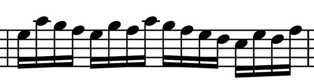
I have thoughts, but they aren't very nice, so I will keep them to myself. My Patterson Beams only does what you are showing if the maximum angle is set to a very small angle. I have mine set 10 degrees and up depending on the situation.
M1 Mac mini (OS 12.4), Dorico 6, Finale 25.5, GPO 4, Affinity Publisher 2, SmartScore 64 Pro, JW Plug-ins, TG Tools, Keyboard maestro
John Ruggero wrote: ↑10 Nov 2021, 13:21
I have thoughts, but they aren't very nice, so I will keep them to myself.
Please share! You've probably spent at least as much or more time looking at piano music as anyone on here, so I'd be curious what you'd prefer to see here.
John Ruggero wrote: ↑10 Nov 2021, 13:21
My Patterson Beams only does what you are showing if the maximum angle is set to a very small angle. I have mine set 10 degrees and up depending on the situation.
I forgot that I had been messing around with my PB settings. I removed the registry key to reset it to default and now get this:
Fred, let's just say that I prefer that the beams follow the notes in a musical way, as Schonbergian says, but without creating bad angles needlessly with the staff lines. Examples of this would be what Ben did in Dorico and I tried to do in Finale in a recent thread concerning Henle and your Patterson example immediately above.
The farther one goes back in hand engraving the more the beams follow the notes and the steeper the angles get. So no one seems to have told the old engravers that this might cause printing issues. And looking at the old editions makes one wonder if this danger has been overblown. But some recent engravers seem to have bought into this theory hook line and sinker.
Last edited by John Ruggero on 11 Nov 2021, 15:41, edited 2 times in total.
M1 Mac mini (OS 12.4), Dorico 6, Finale 25.5, GPO 4, Affinity Publisher 2, SmartScore 64 Pro, JW Plug-ins, TG Tools, Keyboard maestro
Here's what I get with my current settings in Dorico, which as usual is half-way inbetween.
Screenshot 3.png (21.05 KiB) Viewed 8316 times
I agree that the dangers of 'train crossing' diagonals is over-stated, particularly in modern printing. As with all things, there's a balance to be struck between 'direction' and the cleanliness of beam on the staff.
It looks pretty strange, but has any publisher attempted something like that before? Obviously publishers like Alphonse Leduc don't extend the stems into the beams ("French beaming") but I don't think I can recall ever seeing anyone mask out the staff lines before. Obviously it would have been a PITA with plate engraving as the staves are etched first. Just wondering if any publisher has ever taken that approach to minimizing wedges.
Masking the staff lines rings a bell, but can't recall when it came up. It looks fine to me in a small example. Not sure how it would play out in the real world.
M1 Mac mini (OS 12.4), Dorico 6, Finale 25.5, GPO 4, Affinity Publisher 2, SmartScore 64 Pro, JW Plug-ins, TG Tools, Keyboard maestro